


Design an Email Newsletter in Photoshop
Email newsletters are becoming more and more popular with businesses, it’s almost becoming a kind of trend. It is, by far, one of the most effective ways to spread the word about up and coming projects, company news, and other business-related stuff to a potentially large audience. Obviously you need to have people on the receiving list first, but even if you only have a small number of recipients, it doesn’t matter. An audience is an audience.
Creating an Email newsletter is just like creating a website. We design the final product in Photoshop and then it is delivered to readers through HTML. This first part will cover the design process of creating an email newsletter.
Difficulty: Beginner – Intermediate
The Final Product
Here’s an image of what the Newsletter we are going to be designing looks like.

1. Getting Started
The majority of newsletters that are sent via email these days have a fixed width rather than a fluid/liquid layout. This is because email clients don’t use the full width of the screen to display an email message and the last thing you want in an email newsletter are horizontal scroll bars. So with this in mind it’s generally a good idea to design newsletters around a width of 550-600px. The height doesn’t matter as much but readers may read the email in a preview pane before opening the actual email message (I do) and so it’s a good thing to remember that the average preview pane is around 300-500px in height so make sure any important bits of the email are in this area.
2. Setting up Photoshop
Open Photoshop and create a new document with a width of 800px and a height of 1000px and a resolution of 72pi (make sure the colour mode is RGB, too.)
 Fill the background with a nice light grey, I’m using #ebebeb and create a container with a width of 600px filled with white and position this in the centre of the document.
3. Allow the user to view the email in their browser of choice
![]()
It’s always good to keep accessibility in mind so make sure you give the reader the option to view the newsletter in their web browser. This is because not all clients will download images from an email by default, therefore any important graphics that you need to be shown in an email could potentially not be shown straight away. If the user wishes to the view the full message (with images) in their client then they will have to download the images to their machine. This is another good reason to give the reader the option of viewing the email in their web browser.
4. Creating the email header

Grab the Rounded Rectangle tool (U) and create a selection 560px wide, 85px high and a corner radius of 10px and fill it with a nice dark grey. Then with the selection made add a title for your Newsletter along with the month and some contact details if you wish. It’s a good idea to use a nice bold font so readers can clearly see what the email they’ve received actually is. For this reason I am using Myriad Pro Bold Condensed for everything in the header.
5. Creating the ‘main’ part of the newsletter
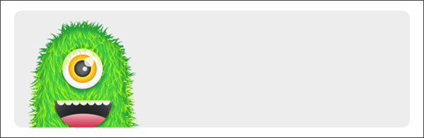 The main part of our Newsletter as you can see from the preview at the beginning of the post is a section that’s telling the reader they are entitled to a free bar of Monsterchomp. So, Similar to what we did above, create a selection using the Rounded Rectangle tool (U) with a height of 165px and a width of 560px and a corner radius of 10px. This time I’m using a light grey for the background colour. With the placeholder well, in place, go grab an image of an awesome looking monster. I’m using the Green monster from Chris Spooner’s Free Monster Vector pack which can be downloaded here.

Grab the Rounded Rectangle tool (U) and make a similar selection as you have been doing (keeping the corner radius at 10px). This time fill it with white so that it stands out against the light grey and any text that we place inside will appear nice and crisp. Now we need to make this rounded rectangle into an actual speech bubble. Grab the Pen Tool (P) making sure that it’s on ‘Shape Layers’ mode and create a shape with three points pointing towards the monster’s mouth. The shape is almost like a right-angled triangle, except without the right angle, duh.

Using the Horizontal Type Tool (T), add some text inside the speech bubble. Again, I’m using Myriad Pro Bold Condensed. The text has to be easy to read because this is the main part of our email. It’s what we want the users attention drawn too. After you’ve wrote a message, place some ‘legal text’ underneath the speech bubble using a clear sans-serif font with a font size of 11px.
6. “How do I claim my free Monsterchomp bar?”
Now that the user has seen that they are entitled to a free bar of Monsterchomp they want to know how they can claim it. The main content area will be 2-columns. On the left (395px) we’ll have the instructions that tells the user how they can claim their free bar and on the right (155px) we’ll just put some Promotional Terms and Conditions (yer, moar legal stuff).
 Create a title for the content in a large font, keeping it crisp. I’m using Arial for all the email content (I like to keep font faces to a minimum in newsletters). Then add some instructions that clearly tells the user how they can claim their free bar.

Create another Rounded Rectangle (U) selection on the right hand side and fill it with a light grey. Inside here you want to put Terms and Conditions of entry. Well, you don’t have to, I’m just doing this to give you an idea of how to design a 2-column newsletter.
7. Submitting their entry

Keeping usability in mind for newsletters, we want to keep things simple. So, once the reader has done what they were supposed to they should be able to submit their entry easily without any fuss.
Again, using the Rounded Rectangle Tool (U) create a large selection, filling it with a nice light grey. We want to make this a button for the user to click on (keeping usability in mind). So, using Myriad Pro Bold Condensed (again…), Type a message in the box to tell the reader that this is a button and should be clicked once all instructions are completed. To make the text stand out the bit further, Duplicate the Layer, change the text colour to white, position it below the main Text layer, move it 1px down and 1px right and then reduce the opacity until you’re comfortable with the outcome.
8. Giving the readers more
 Sometimes freebies aren’t enough in this world and the readers will want more. So, offer an incentive for the user to enter.
9. Giving the reader the ability to un-subscribe from the mailing list
 Every newsletter needs to have a link or a button to allow the reader to freely un-subscribe from the newsletter. So, write a message at the bottom with a link to allow the user to un-subscibe.
Conclusion
Here’s what we’ve designed in this tutorial:
Stay tuned and subscribe to our RSS-feed or follow us on Twitter because next time we’ll be learning how to code the design into a functional HTML newsletter ready for delivery!
This entry was posted on Friday, July 9th, 2010 at 11:00 and is filed under Tutorials. You can follow any responses to this entry through the RSS 2.0 feed. You can leave a response, or trackback from your own site.
Amazing tutorial. I like the clean style and your monster.
Thanks
Sabine
nice tut. a perspective from the code design would be appreciated
@sergiu : The development tut will be live next week.
Nice design…thanks for share the tutorial
Thanks for the kind words / responses.
very Amazing .Thanks.
Thanks so much!
AWESOME tutorial! very helpful!!!
one typo:
Having trouble viewing this email? View it IN/WITH your browser.
Hi i like your tutorial, simple and straight to the point. Now having created this in photoshop how do you send the image as an email? thanks