


Create a Cool Mask Transition Slideshow: Part 1
Ever bored of simple sliders and fading slideshows. Want to create something different and unique. In this tutorial we are going to create a beautiful mask transition slideshow, starting from the photoshop to the final working product. To put a cherry on the top we will create this in the form of a jquery plugin, so you can use it your next project without having any limitations. Let’s get started !
Tutorial Structure –
- Creating the slideshow in photoshop.
- Converting into HTML/CSS.
- Setting up workspace for the plugin.
- Creating a plugin.
- Putting it altogether.
In this part we will work till the html version of our project.
The Photoshop part –
Open up photoshop and create a 1000px by 800px document. Follow the steps –
Step 1 – Creating the background.
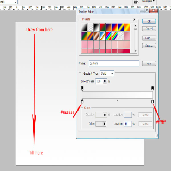
Creating a soft background is important as you want the viewer’s focus on the slideshow. Select the gradient tool and set #eaeaea as the starting color and #ffffff as the ending color. Now draw a linear gradient.
Step 2 – Creating the slideshow holder.
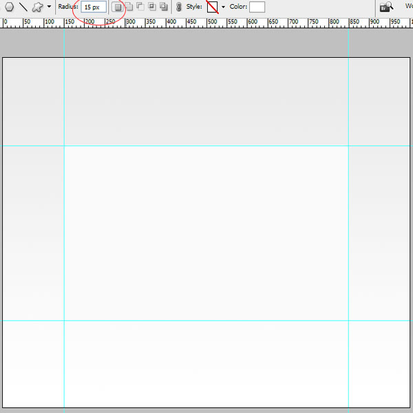
Now that we have created the background, create a new folder and name it holder. Now rule out grid lines with 150px distance vertically and 200px distance horizontally. Select the rounded rectangle tool with radius 15px and draw the rectangle with grid lines as the limiting boundaries.
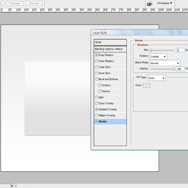
Step 3
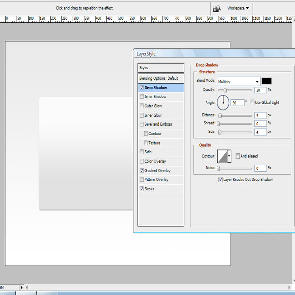
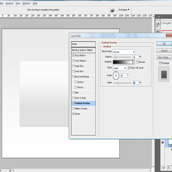
After creating the rectangle, we will add some effects to it. Open the effects panel and add the following effects to the rectangle.
- Drop Shadow – Opacity – 20% , distance – 5px and Size – 4px. Rest of the values remains unchanged.
- Gradient Overlay – opacity – 10% , scale – 50 and rest of the values remains unchanged.
- Stroke – size – 1 px, color – #e7e7e7 and rest of the values remains unchanged.
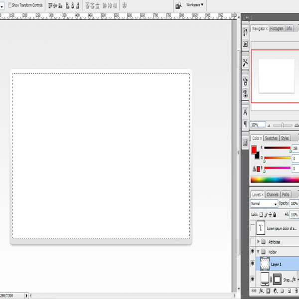
Step 4 – Creating the inner holder
We would need an inner frame for placing our images, hold down the control key and click on the rounded rectangle, that will give you the selection of the rectangle, now go to the select menu and then to the modify submenu, select contract option with 10px as the value. Now create a new layer and fill that contracted selection with white color, optionally you might also want to add a stroke to it.
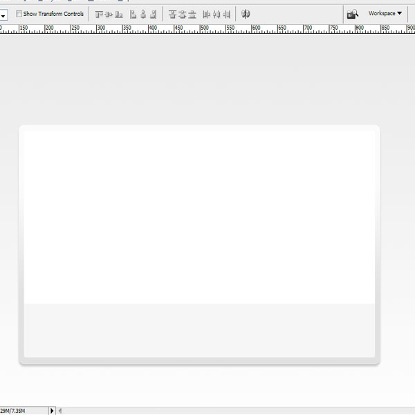
Step 5 – Creating the title and description holder
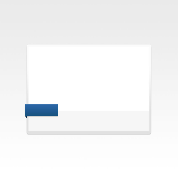
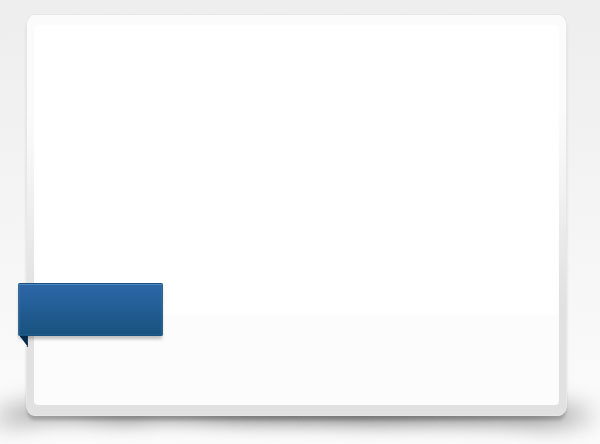
Since now we have got a nice looking frame, we will also create a holder for image description and title. Create a new folder elements, In that folder create a rectangle, 90px in height and width almost as same as the inner holder and place it at the bottom of the slideshow frame and also reduce it’s opacity to 30%.
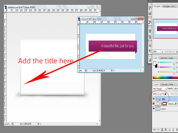
Step 6 – Add a heading Background
We need a cool background to highlight the heading of the image, so goto 365 PSD, here these guys offer some awesome files free to download, the one we are interested in is a ribbon available at day 23. Download it and add it in our psd file, remove the text title. Transform it horizontally and place it at the lower left corner of the slideshow just above the label holder.
Change the following effects of the base layer present in the title folder-
- Gradient Overlay – from #2c65a6 to #185381
- Stroke – #185381
- Additionally – Hold down the control key and click on the triangle layer. A selection will be made,select the triangle layer then with the brush tool keeping the foreground color #003054, stroke the selection two or three times.
Note: keep the rest of the values unchanged for base layer.
Step 7 – Adding a base shadow to the slideshow.
We will add a shadow at the base of the slideshow, for this create a ellipse using the shape tool with major axis equal to the width of the slideshow, rasterize the layer.
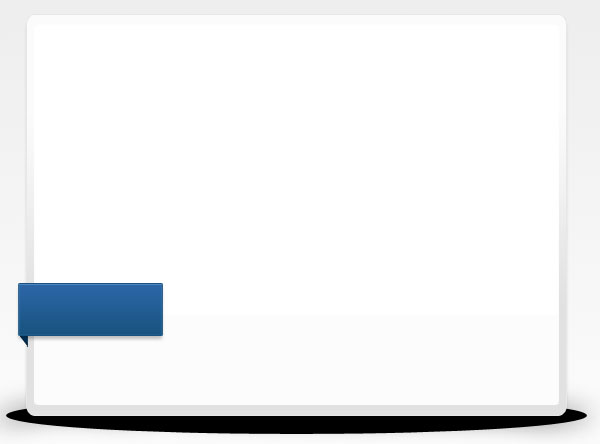
Add a gausssian blur of about 10px and adjust to opacity around 50%.
You can remove excess shadow by using the eraser tool, until it suits your needs.
Step 8
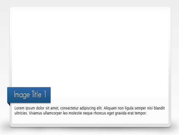
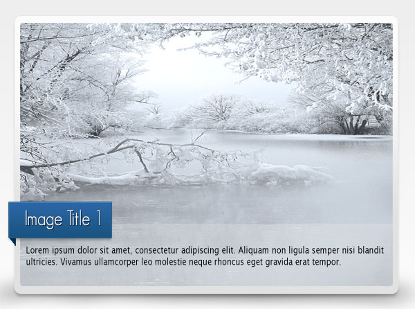
Now add a title to the ribbon, the font used is GeosansLight, which we will be using in the html too and also add some dummy data to the image description.
We will use GeosansLight in HTML using cufon and the text in the image description is Lucida Sans.
Step 9 – Adding the image
Finally add the image you want in the slideshow, I am using images from Elena Dudina’s awesome collection.
Phew, that’s it for the photoshop part. Time to convert it into HTML/CSS.
Slicing into HTML/CSS.
Before starting to code into html and css, we will see what are the images we are in need from our PSD file.
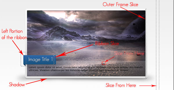
- Slice of the background.
- Left portion of the blue ribbon.
- Slice of the blue ribbon.
- Shadown of the slideshow.
- Slice from the outerframe.
- Slice from image description holder.
- Don’t forget the images too :).
Since slicing images and exporting slices is easy, I have already skipped the steps and they are saved in a ‘ i ‘ folder in the css folder of our project.
Step 1 – Directory structure
Start off by creating a directory structure similar to the image below –
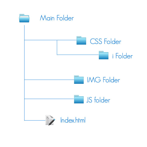
- Main folder will contain all the category folders and main html file.
- Here CSS foler will contain our main style sheet and plugin stylesheet.
- Here i folder in css will contain, slices and images of our slideshow.
- js folder will contain the javascript files which we will use and our plugin.
- And Finally the img folder is where we will keep our images.
Step 2 – HTML
Create a html file index.html and add the following html code to it.
<html>
<head>
<!-- Importing javascript files to be used in the page -->

<script type="text/javascript" src="js/jquery-1.4.2.min.js" ></script>
<script type="text/javascript" src="js/cufon-yui.js" ></script>
<script type="text/javascript" src="js/GeosansLight_500.font.js"  ></script>
<script type="text/javascript" src="js/raphael-min.js"  ></script>
<script type="text/javascript" src="js/custom.js"  ></script>

<!-- End of Scripts Block -->

<link rel="stylesheet" href="css/style.css" type="text/css"  />

<title>Mask Slideshow</title>
</head>

<body>

<div id="container">

<div id="outerblock">
<div id="innerblock">

<div id="slideshow">
<div>
<ul>
<li><img src="img/im4.jpg" />

<h1 class="title">Image Title 1</h1>
<p>
Lorem ipsum dolor sit amet, consectetur adipiscing elit. Duis vulputate neque id diam adipiscing ullamcorper.
Nam sed metus et velit rhoncus hendrerit volutpat nec sapien.
Nam ut velit laoreet est feugiat porta eu et dolor.

</p>

</li>

</ul>
</div>
</div>
<span id="ribbon-left"></span>

</div>

<div id="frame">
</div>

</div>
<img src="css/i/shadow.png" id="shadow" />
</div>

</body>
</html>
The HTML code is fairly easy to understand, here we have imported javascript libraries that we will use later and a stylesheet for styling our slideshow.
- container is the parent element in which our slideshow will be.
- outerblock is the container that binds all the elements of our slideshow.
- innerblock contains the image and description part.
- frame is our rounded rectangular frame that we have created in photoshop.
- And Finally the base shadow of the slideshow.
Step 3- Creating the frame.
Creating a consistent cross browser rounded rectangular frame is really difficult, the best way to create it by using Raphael JS. Download raphael and copy it to our js folder, since we have already imported it in our html file. Now create custom.js file this is where we will write our js code. Here add the following code –
$(function(){

		   var div = Raphael("frame",701,401);
		   div.rect(0,0,700,400,15).attr({fill:"90-#e1e1e1-#ffffff",stroke:"#e7e7e7"});

		   });
Here first we create a canvas using Raphael function with element’s id, width and height as attributes. Then we created a rounded rectangle in our canvas and set its background with the linear gradient similar to that one in our psd and add a stroke.
Step 4- Adding Cufon
Cufon is a javascript library that allows font embedding, remember we have used GeoSansLight font in the heading. So download Cufon JS and visit their website to generate a JS file for embedding GeoSansLight Font.Generation is very easy, just upload the font and click generate. You will get a JS file similar to GeosansLight.font.js, we have already imported that one in our html page. In the custom.js file add one more line of code, this code embeds our font style on the elements with class title.
Cufon.replace('.title');
Step 5 – Adding the css code.
Create a style.css file in the css folder and add the following code to it –
 { margin:0px; padding:0px; }

h1 { font-size:36px; }

body { background:#ffffff url(i/auraslice.jpg) repeat-x top; }

#container { margin-left:auto;margin-right:auto;width:960px }
First of all we reset margin and padding of all elements to eliminate any future problems, then we add the gradient background to the body. Finally we will align our container element.
Step 6 – Styling Slideshow
We will now style the slideshow, add the following css code in the style.css
#outerblock { position:relative; z-index:2; margin:50px; }

#innerblock { position:absolute; z-index:999;   }

#slideshow { padding:10px; }

#innerblock #ribbon-left { background:url(i/ribbonleft.png) no-repeat bottom left;  width:28px; height:72px; position:absolute; margin-top:220px; margin-left:-18px; }

#innerblock .title { position:absolute; background:url(i/ribbon-slice.jpg) repeat-x; border:1px solid #185381; border-left:0; padding:0px 4px 7px 0px; display:block; color:#fff; margin-top:238px; z-index:3; width:190px; height:44px; }

#innerblock p { position:absolute; width:670px; padding:10px 5px 10px 5px; text-align:justify; font-family: "Lucida Sans Unicode", "Lucida Grande", sans-serif; background:url(i/desc-overlay.png);margin-top:300px;z-index:2; line-height: 20px;}
Here –
- First we will set the z-index of the outerblock to make it appear on top of the frame we created using Raphael and to use z-index, positioning is necessary.
- Then we will make sure that innerblock which contains essential elements such as images and headings is on top.
- Finally we target and style each indivial part of the innerblock like ribbon and description holder.
Step 7 – Adding final effects.
Now we will style the shadow and remove list style for the ul that holds the image. Rest of the attributes we will see in detail in the next part.
#shadow { margin-top:-120px;margin-left:20px }

#slideshow ul { list-style:none;  }
#slideshow ul li{  position:absolute;   }
#slideshow ul li img{  position:absolute;  }
Finally we are done, now we have really awesome slideshow. In the next part we will create a plugin that will add the effect. Check out the demo, its really awesome. The PSD is also available, just in case your not that great in photoshop 😉
With Testking 70-646 tutorial, learn how to create inspiring designs in photoshop. Become expert using Testking 642-446 tutorials and Testking 650-177 guide.
This entry was posted on Sunday, April 11th, 2010 at 10:04 and is filed under Tutorials. You can follow any responses to this entry through the RSS 2.0 feed. You can leave a response, or trackback from your own site.
Awesome transition effect!
Wow, that is an elegant tutorial. Well documented, easy to follow, and truly unique! Great job.
wow!!
Can’t wait for installment number two. This is a great start to exactly what I’ve been looking for.
Thanks!
thanks guys… next part will be online by next week 🙂
Thank U!! I have been looking for a Mask Transition Slideshow tutorial.
this is really fantastic tutorial
This is a bad tutorial. First off, the coding provided and the demo site source codes are different. Second, there is not a single line about the fading images. Where can I change them?