A Delightful Showcase of Restaurant Websites
Beauty , harmony, taste and a long hmmmmm. That is the “perfect combo” when it comes of eating in a restaurant, but how can we transfer this combo to the online environment? In this showcase , we can see a diverse presentation of sites from different cultures that try and succed in creating a consistent visual impact.
Hope you enjoy looking at this websites, as I had “fun” searching for them.
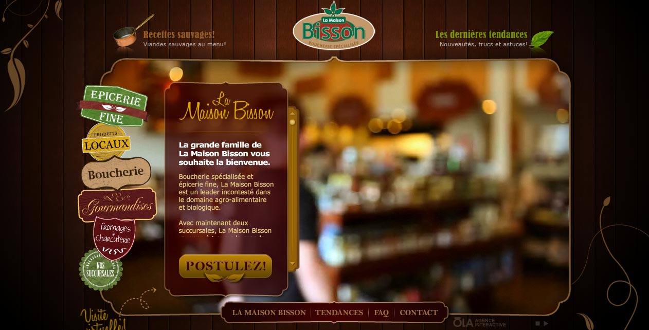
La Maison Bisson
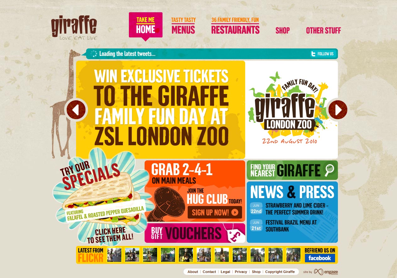
Giraffe
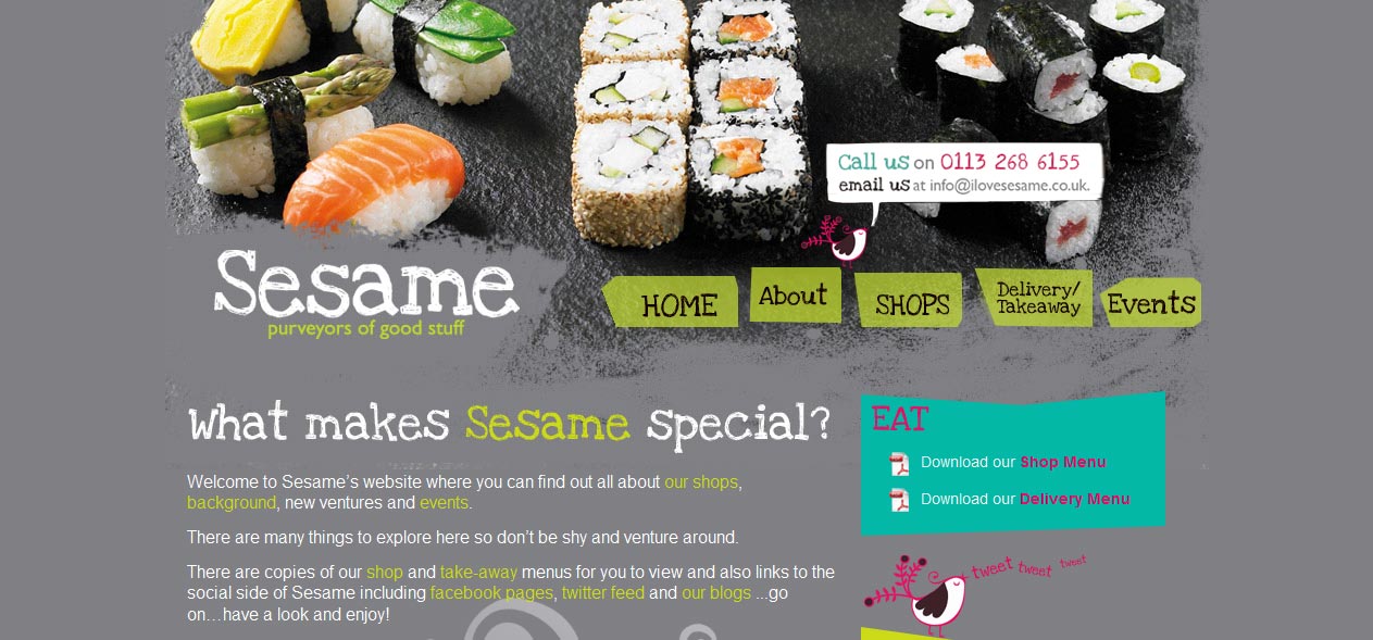
Sesame
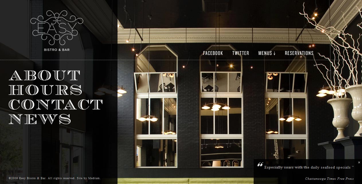
Easy Bistro & Bar
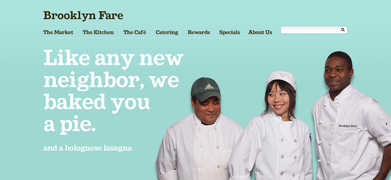
Brooklyn Fare
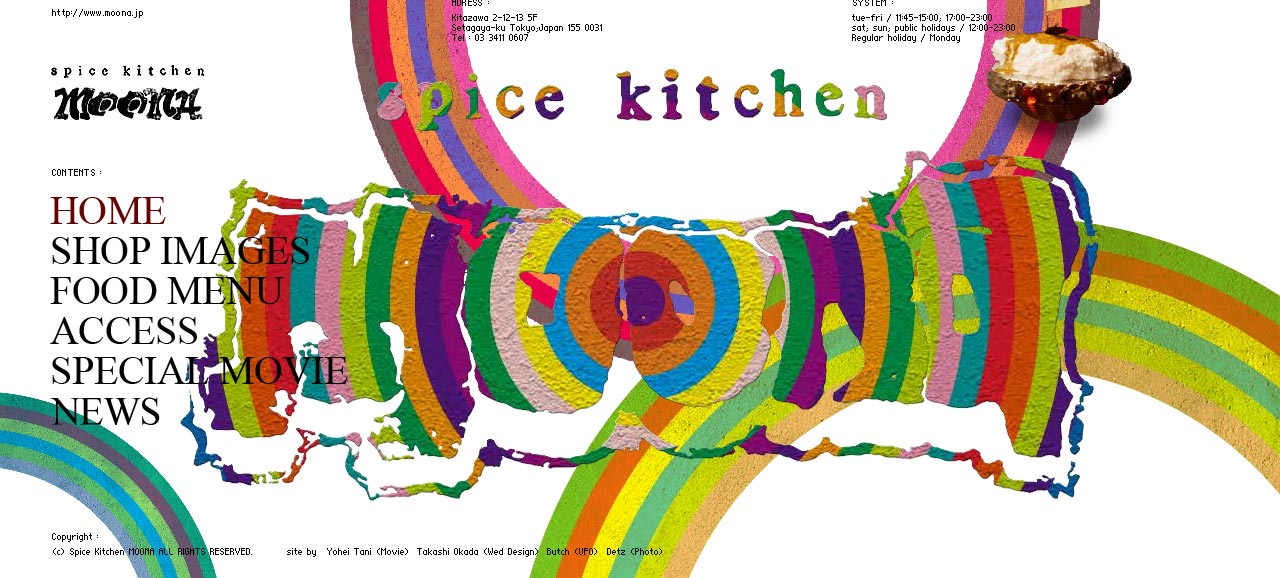
Spice Kitchen Moona
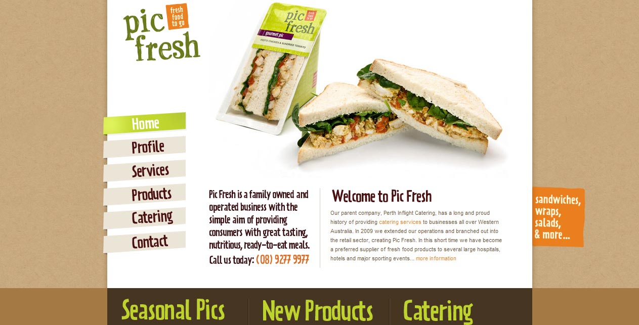
Pic Fresh – Fresh food to go
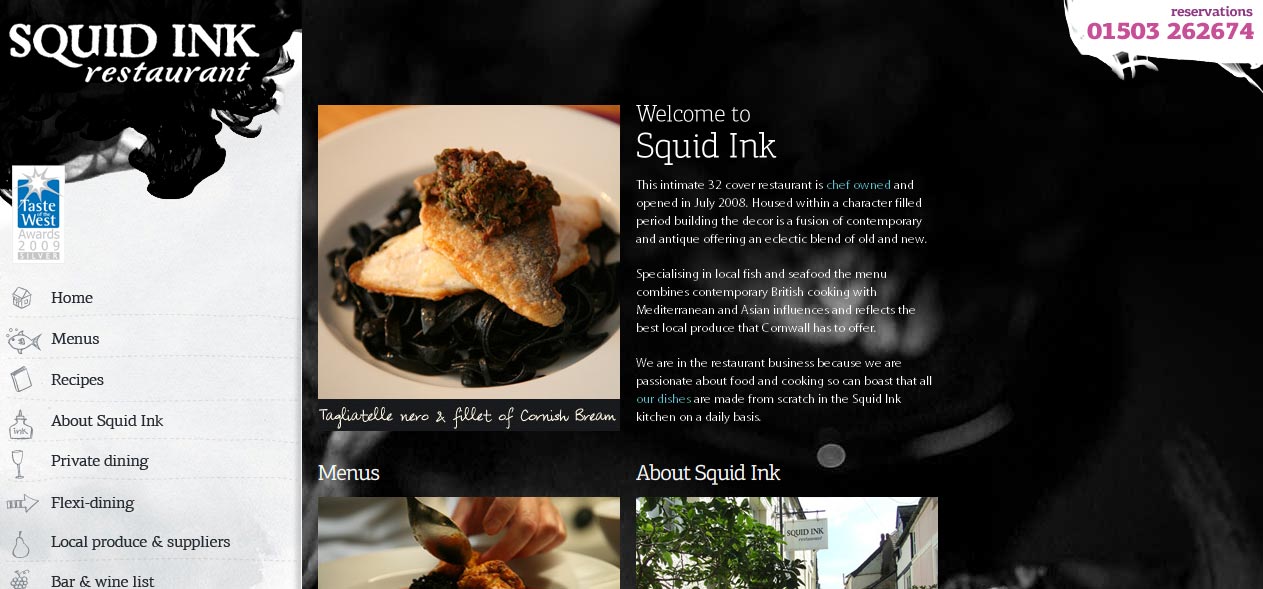
Squid Ink Restaurant
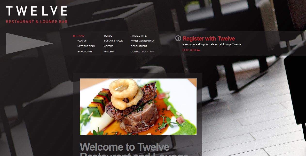
Twelve Restaurant & Lounge Bar
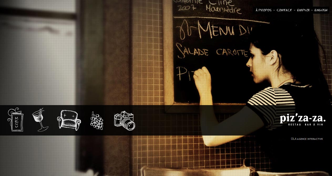
Piz’za-za. Restau Bar a Vin
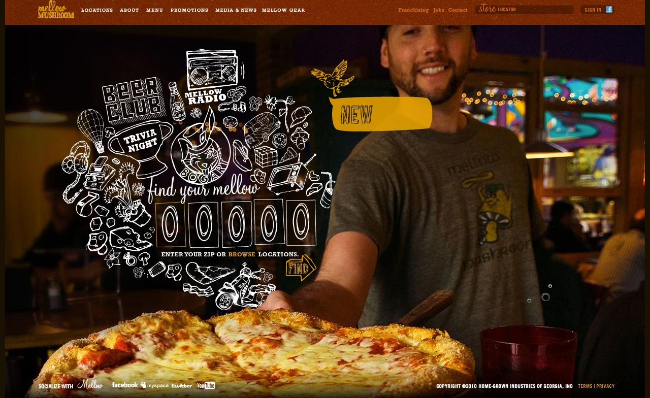
Mellow Mushroom Restaurant
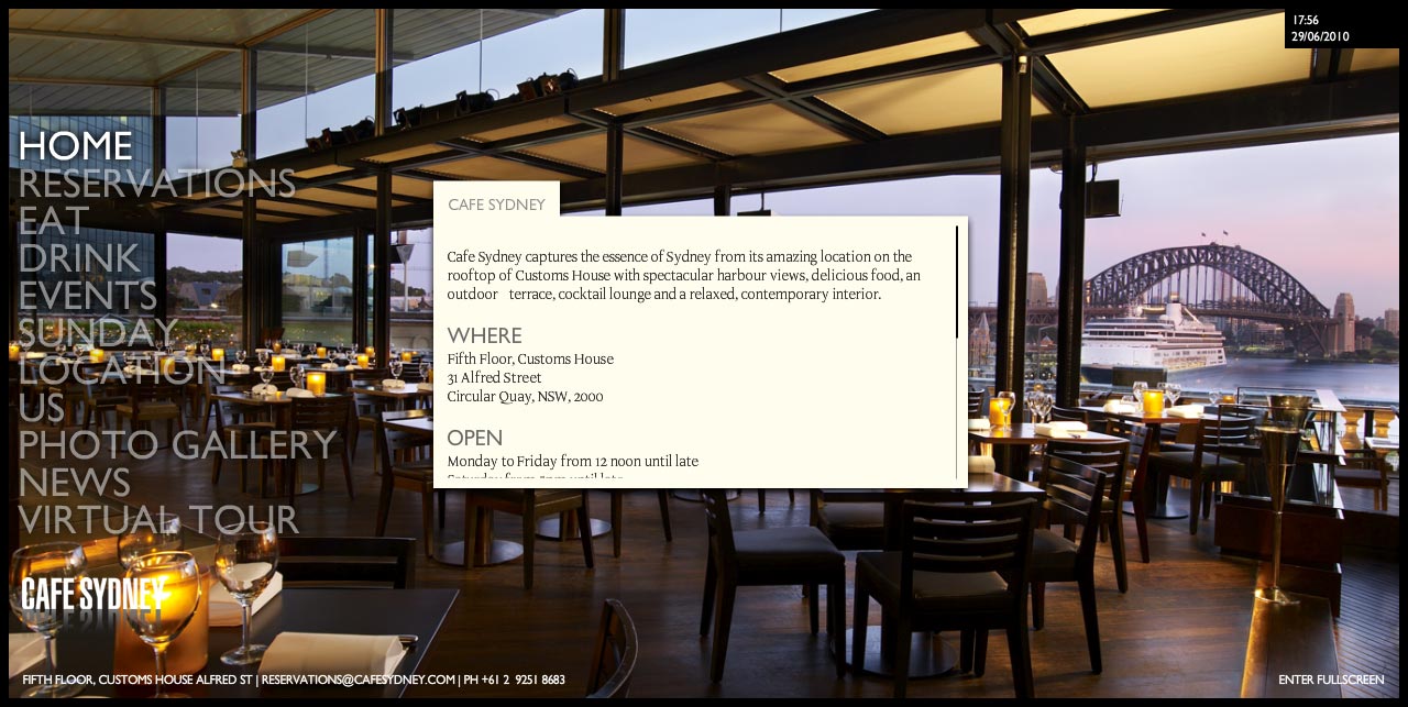
Cafe Sydney
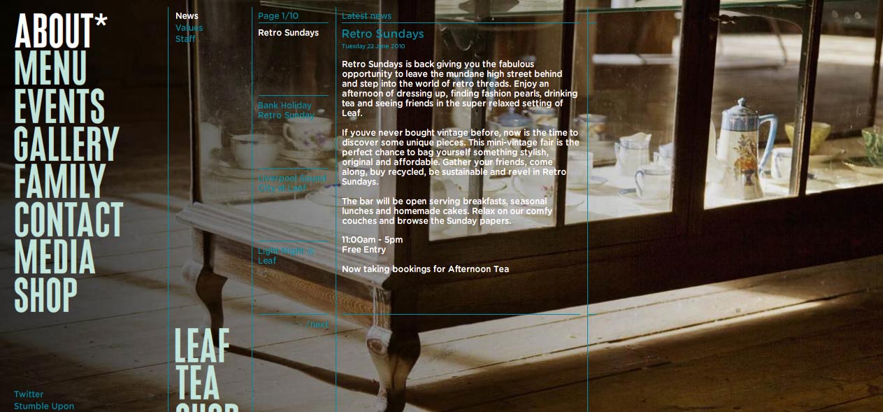
Leaf Tea Shop And Bar
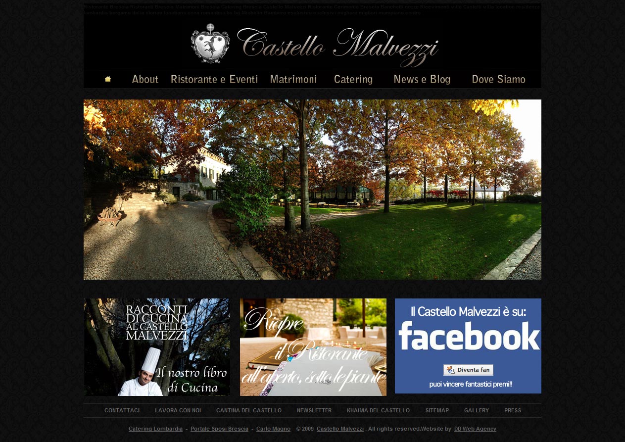
Castello Malvezzi
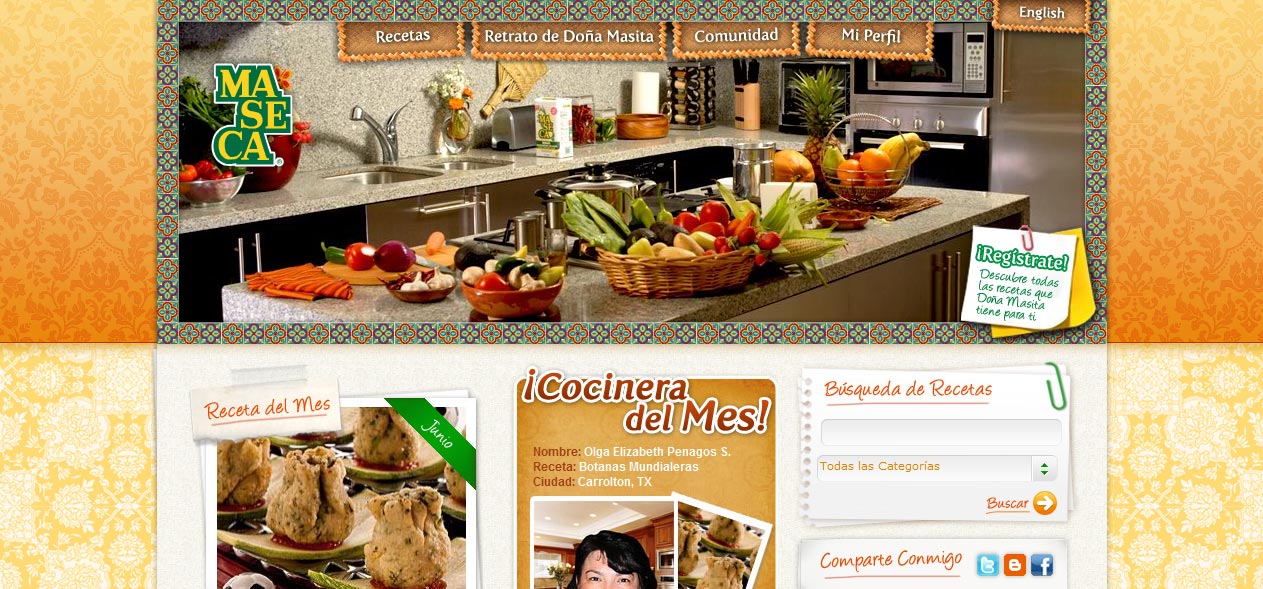
Dona Masita
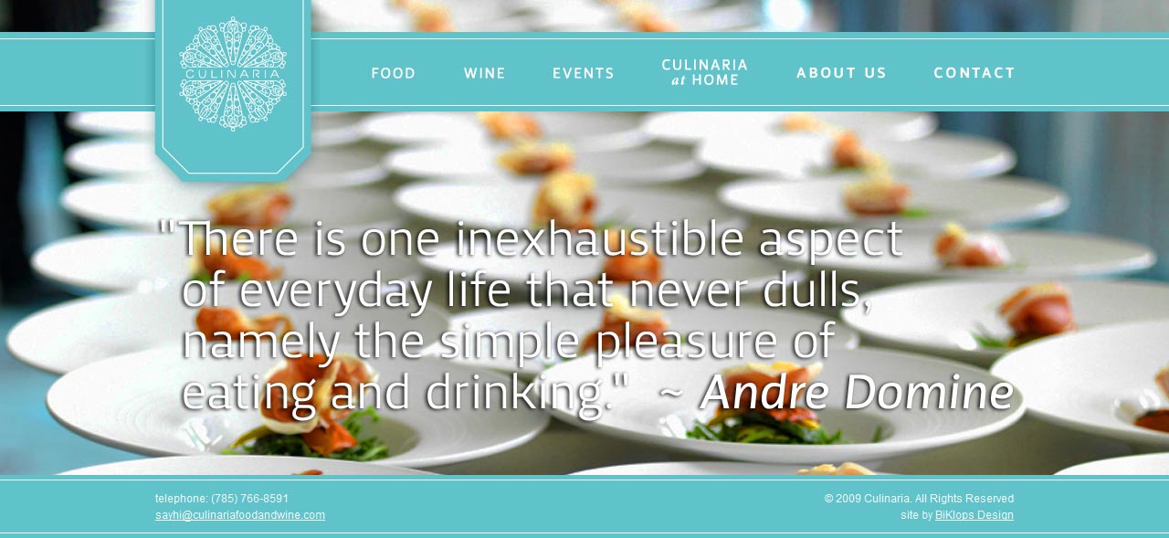
Culinaria Food and Wine
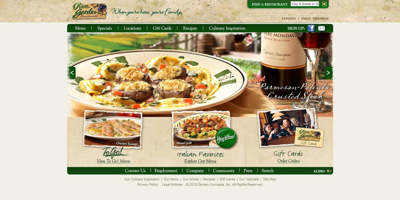
Olive Garden Italian Restaurant
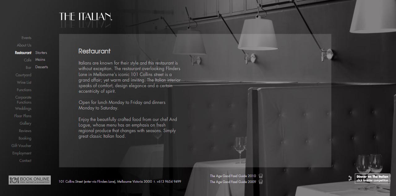
The Italian. Cafe Bar Restaurant
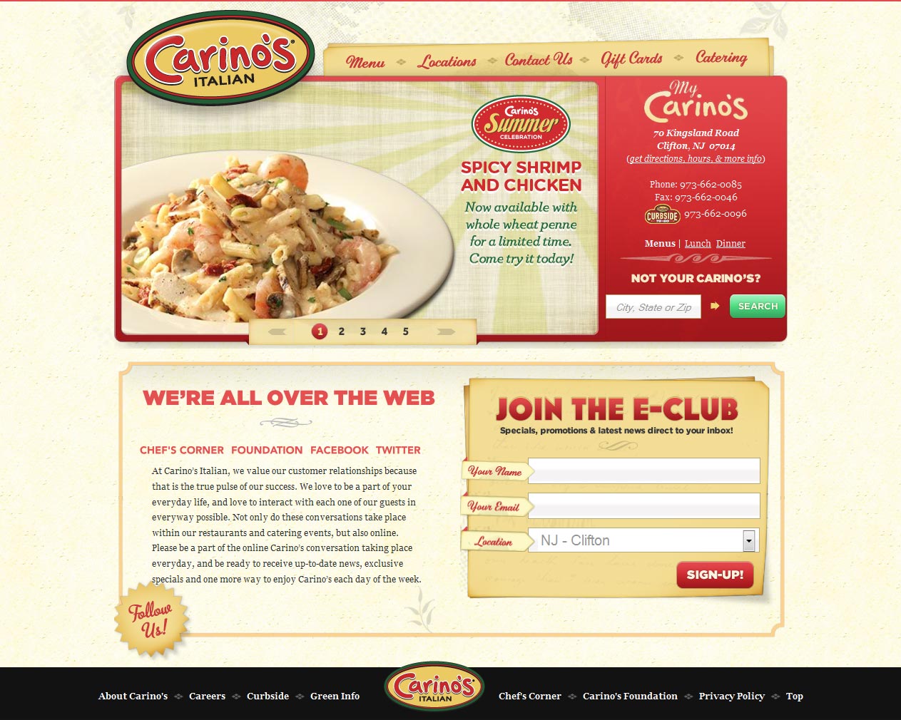
Carino’s Italian Restaurant
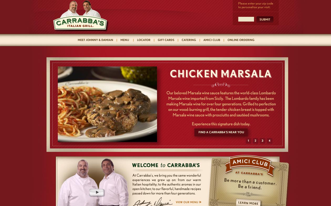
Carrabba’s Italian Grill
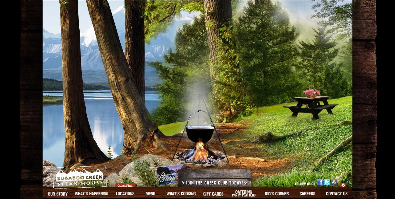
BugaBoo Creek Stakehouse
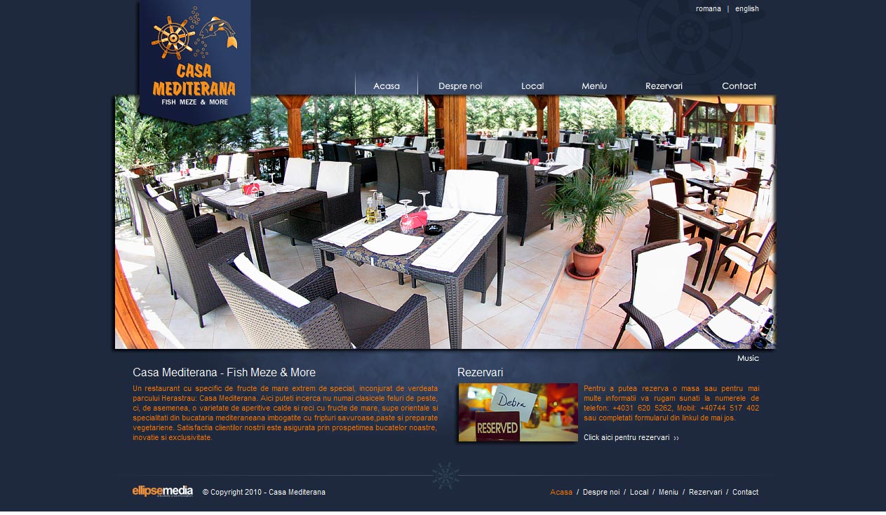
Casa Mediterana Restaurant
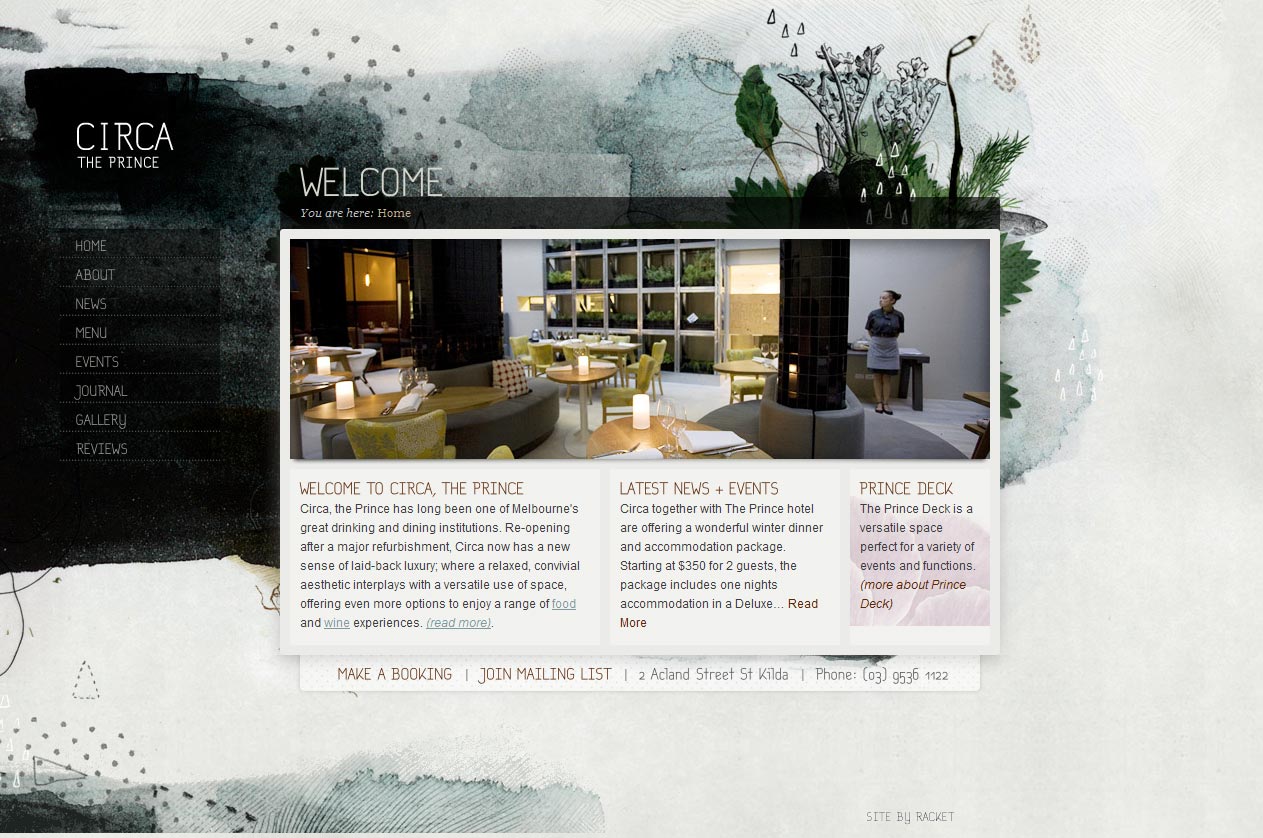
Circa The Prince
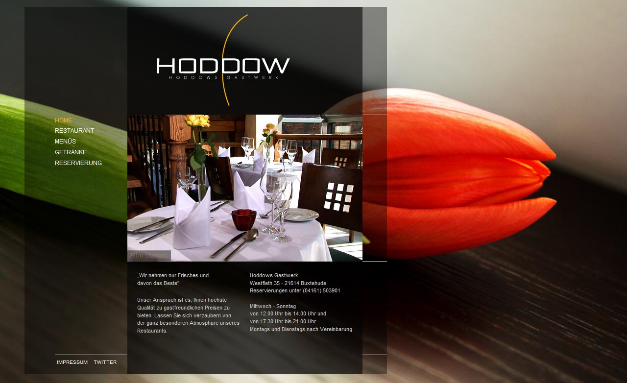
Hoddow Restaurant
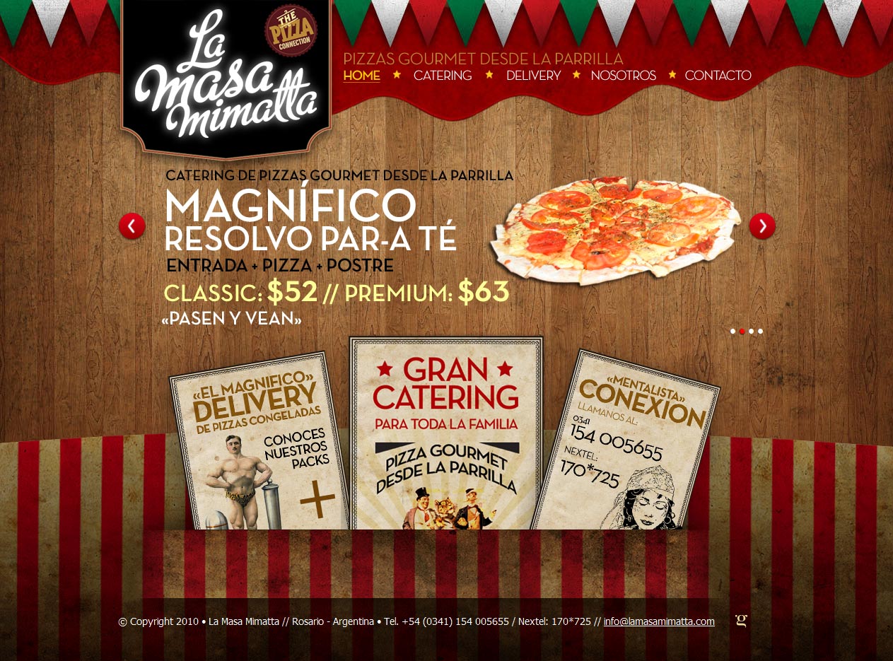
La Masa Mamitta
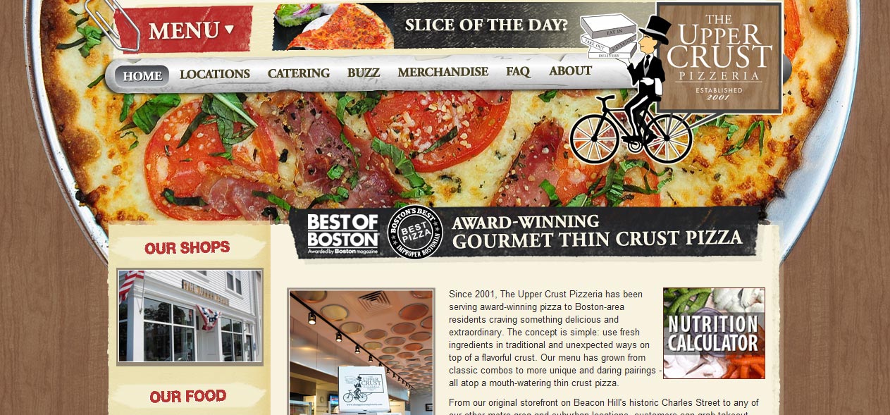
The Upper Crust Pizzeria
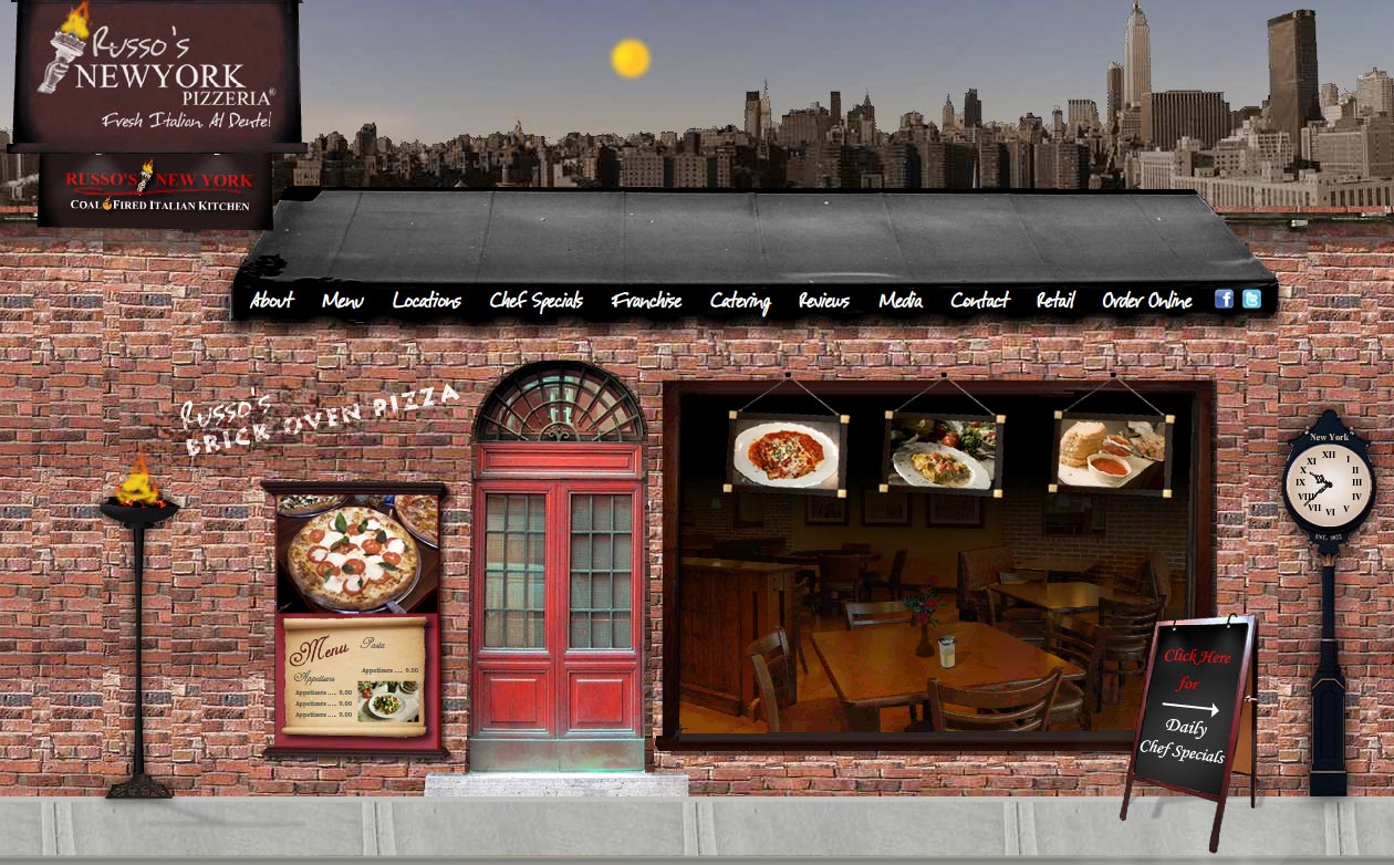
Russo’s Pizzeria
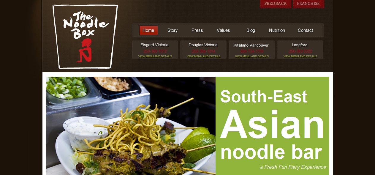
The Noodle Box
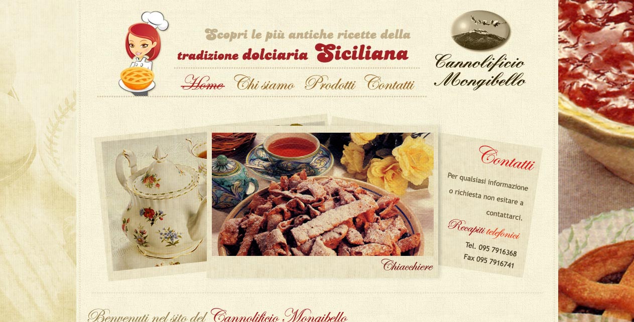
Cannolificio Mongibello
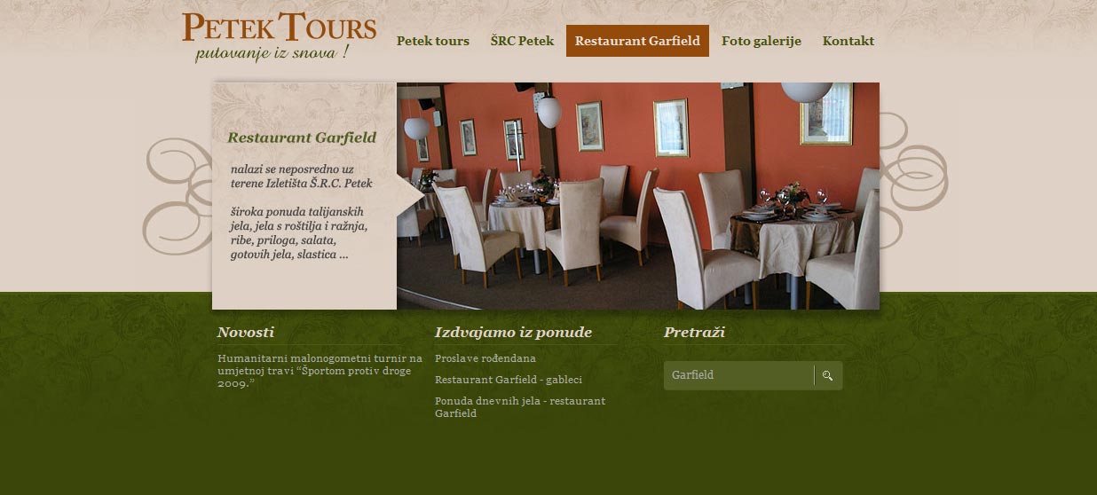
Petek Tours
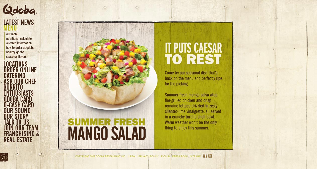
Qdoba
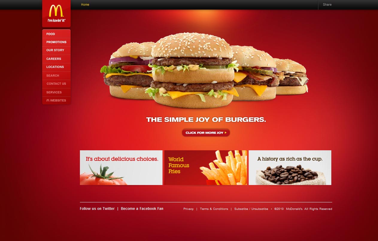
McDonalds
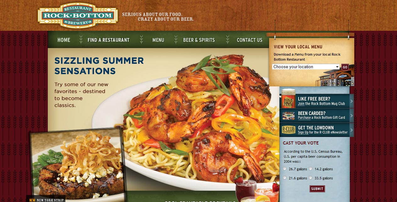
Rock Bottom Restaurant
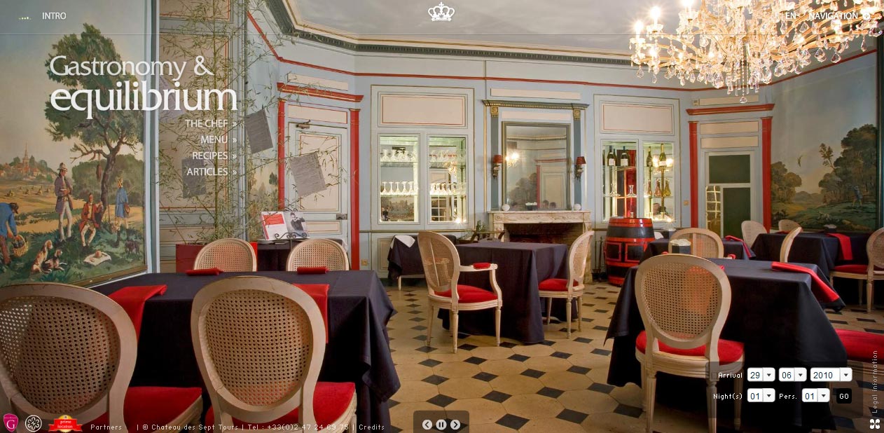
Chateau du Sept Tours Restaurant
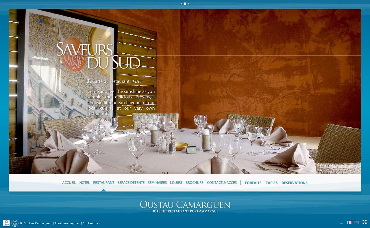
Oustau Camarguen Restaurant
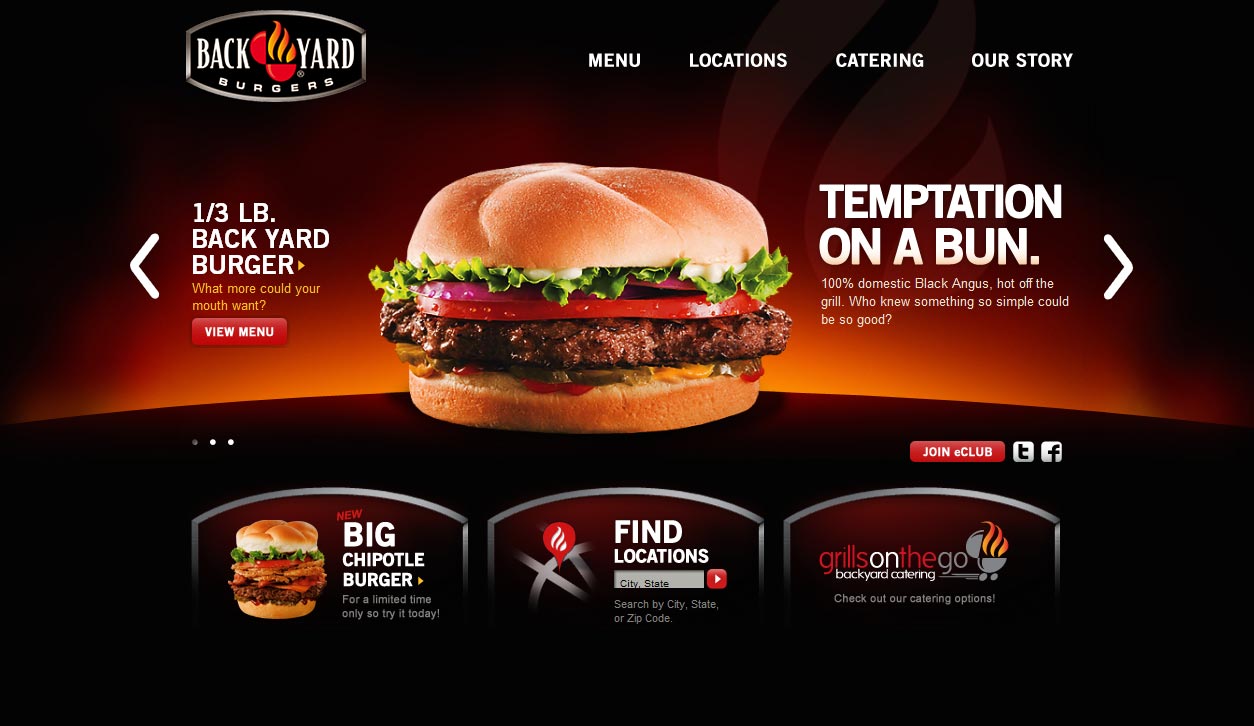
Back Yard Burgers
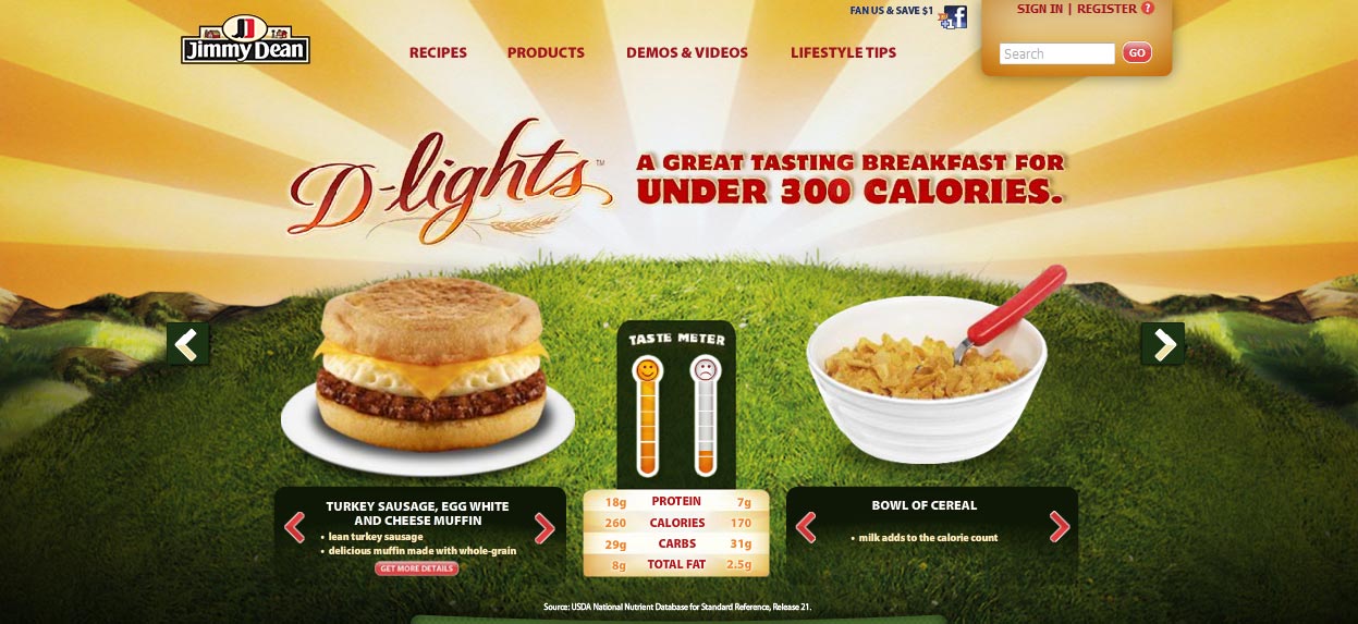
Jimmy Dean
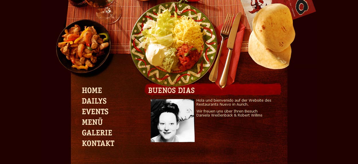
Nuevo Aurich Restaurant
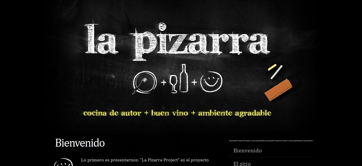
La Pizzara
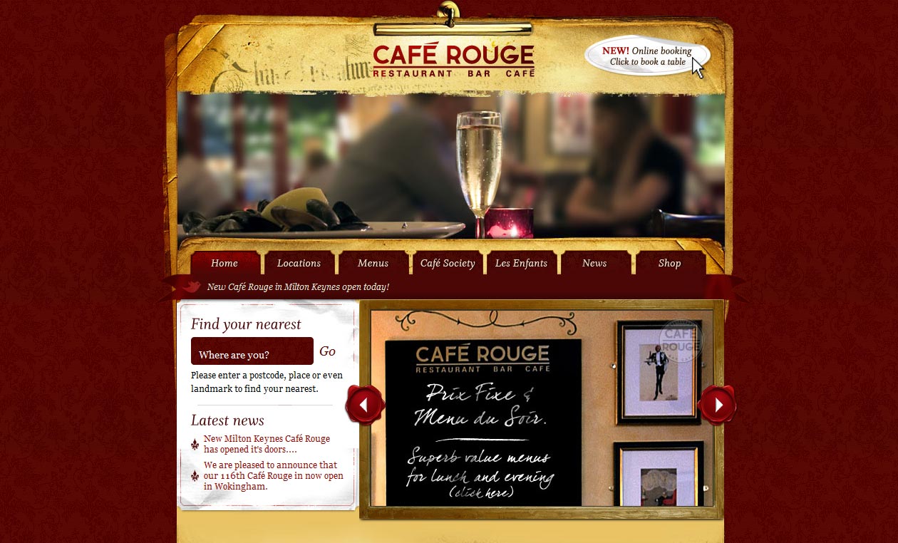
Cafe Rouge
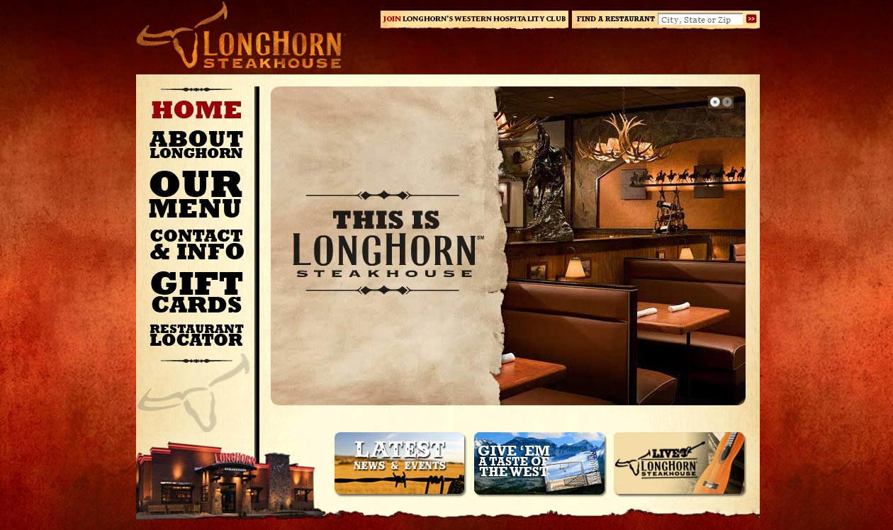
LongHorn Steak House
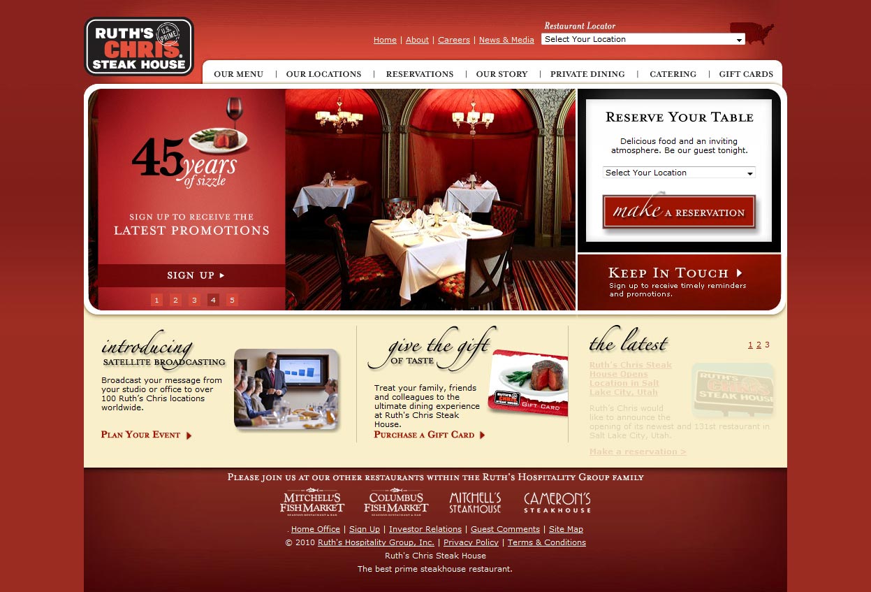
Ruth’s Chris Steak House
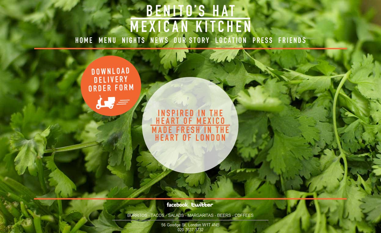
Benito’s Hat Mexican Kitchen
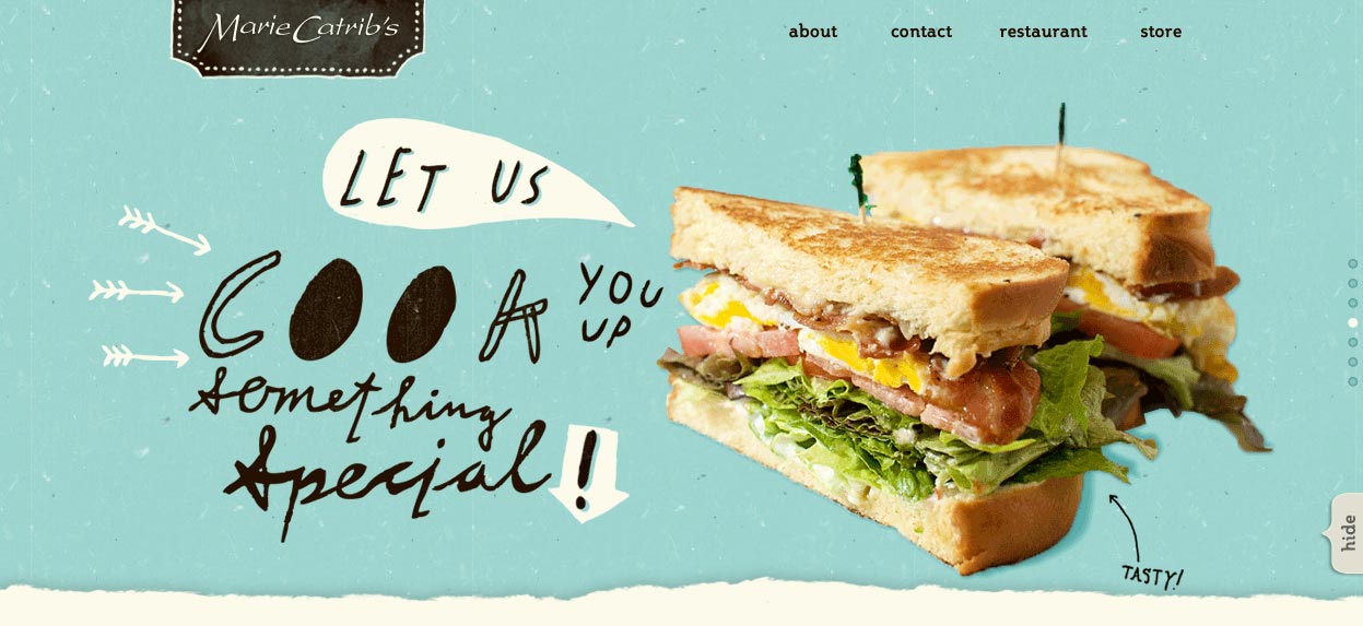
Marie Catbris
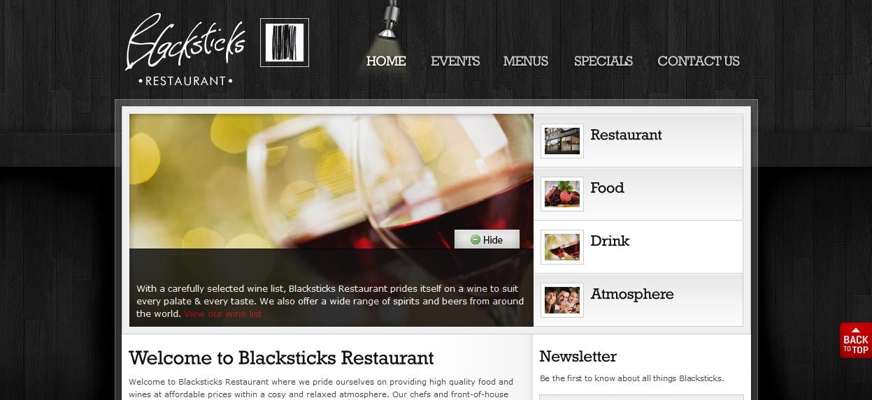
Blackstiks Restaurant
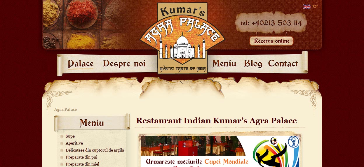
Kumar’s Agra Palace
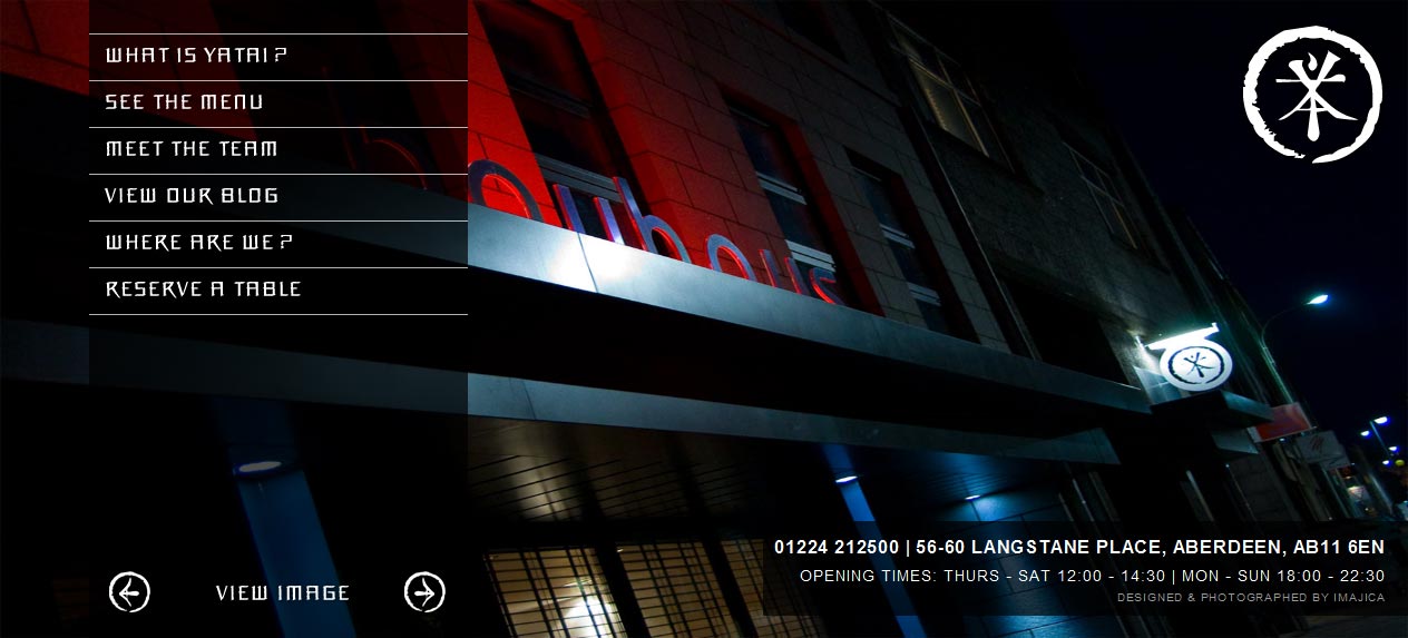
Yatai
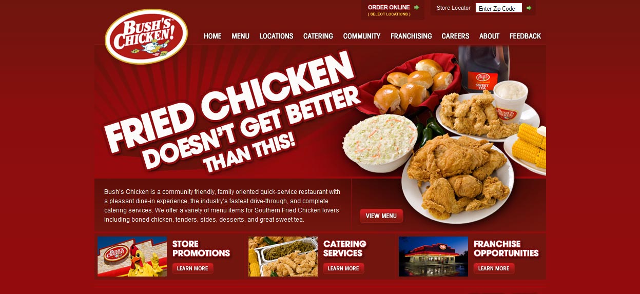
Bush’s Chiken
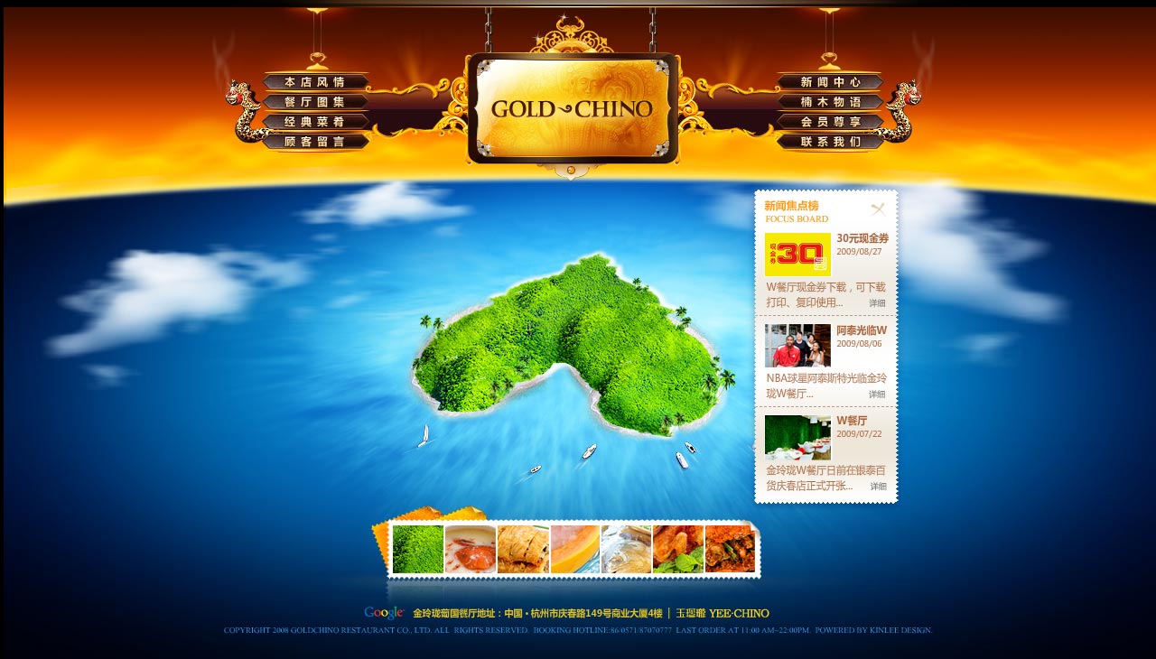
Gold Chino Restaurant
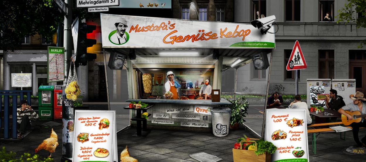
Mustafa’s
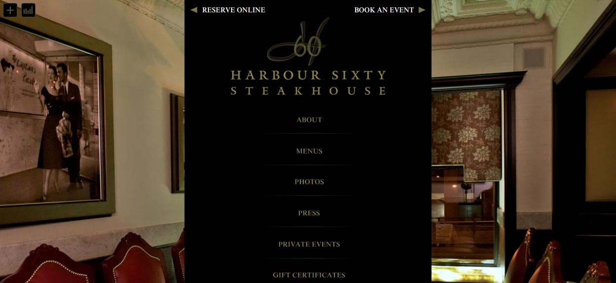
Harbour Sixty Steak House
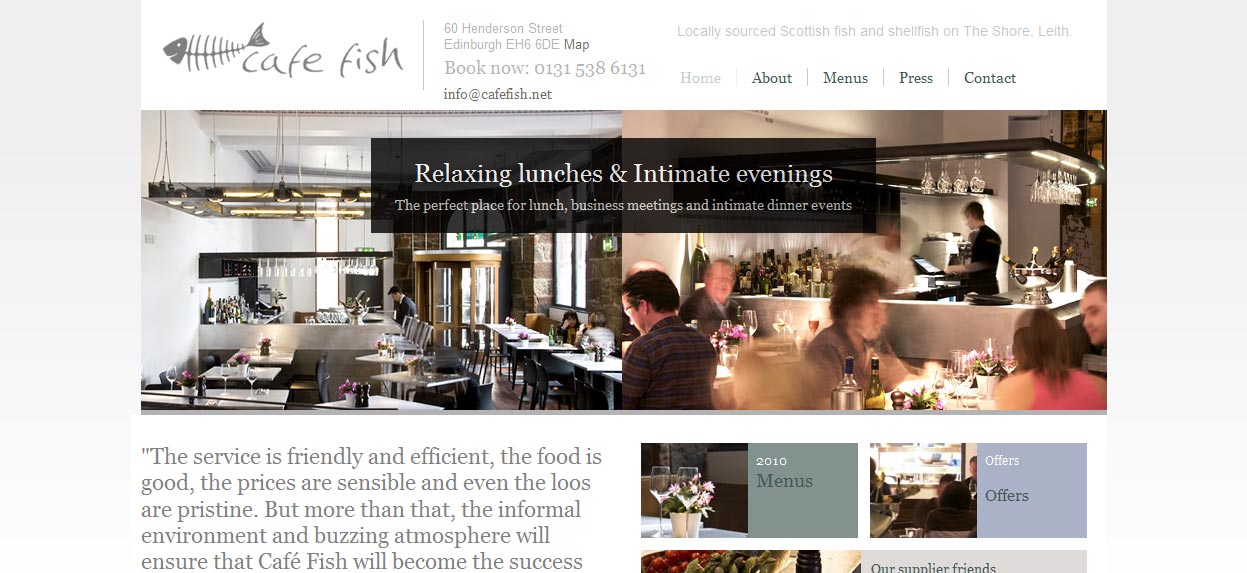
Cafe Fish Restaurant
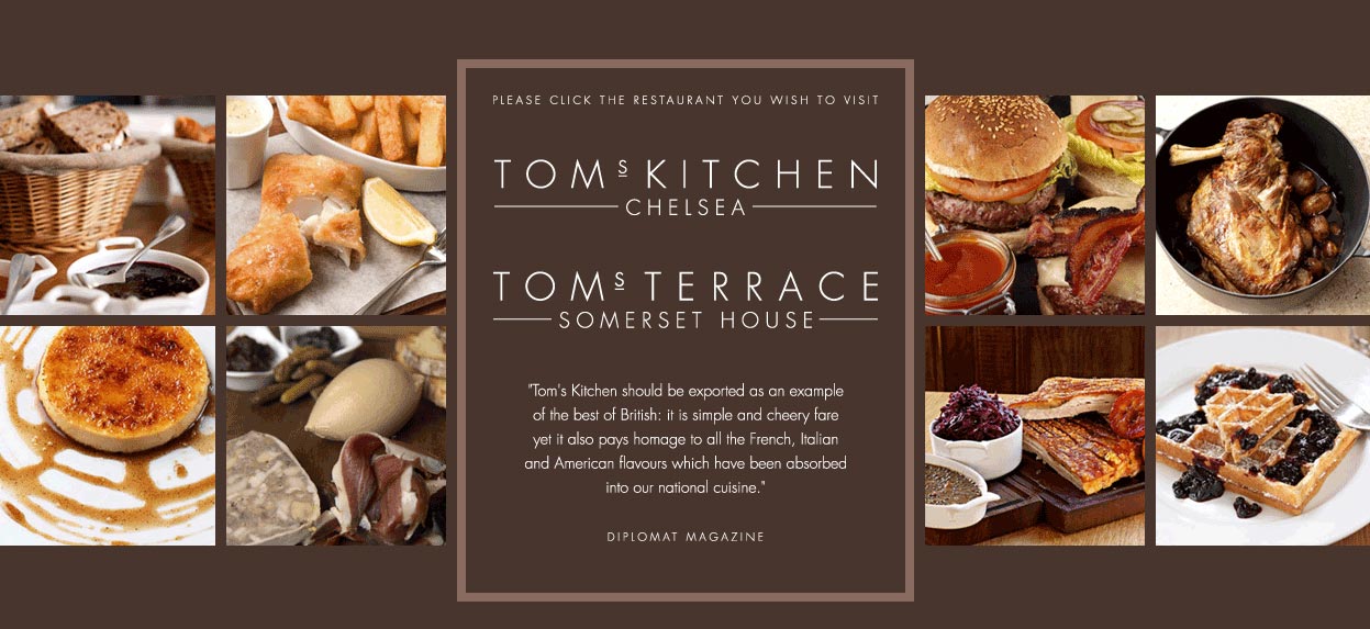
Tom’s Kitchen
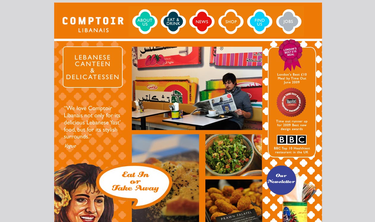
Comptoir Libanais
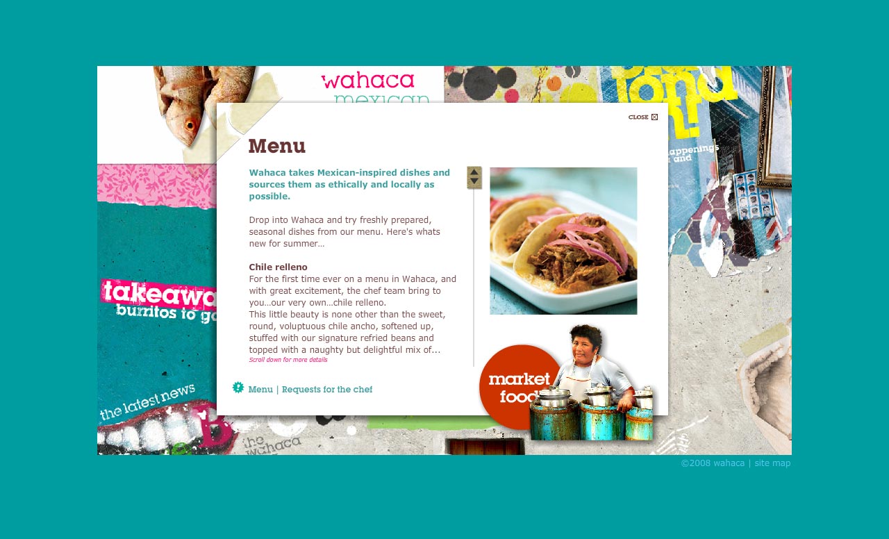
Wahaca
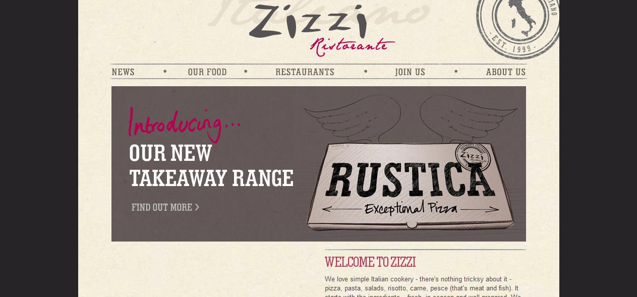
Zizzi Ristorante
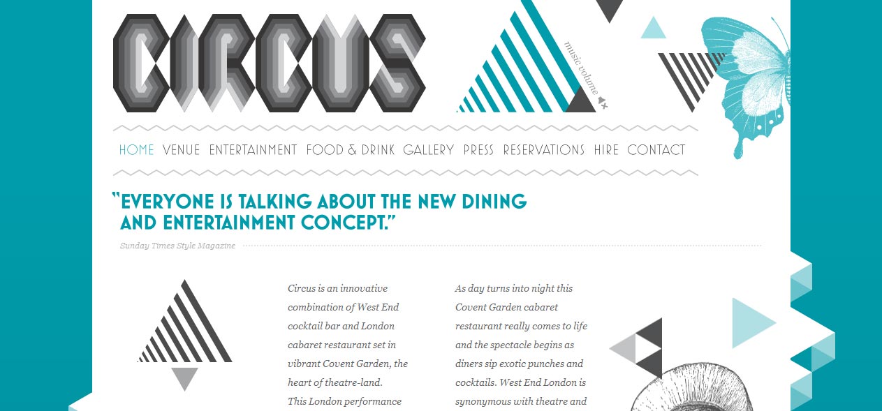
Circus Restaurant Cafe
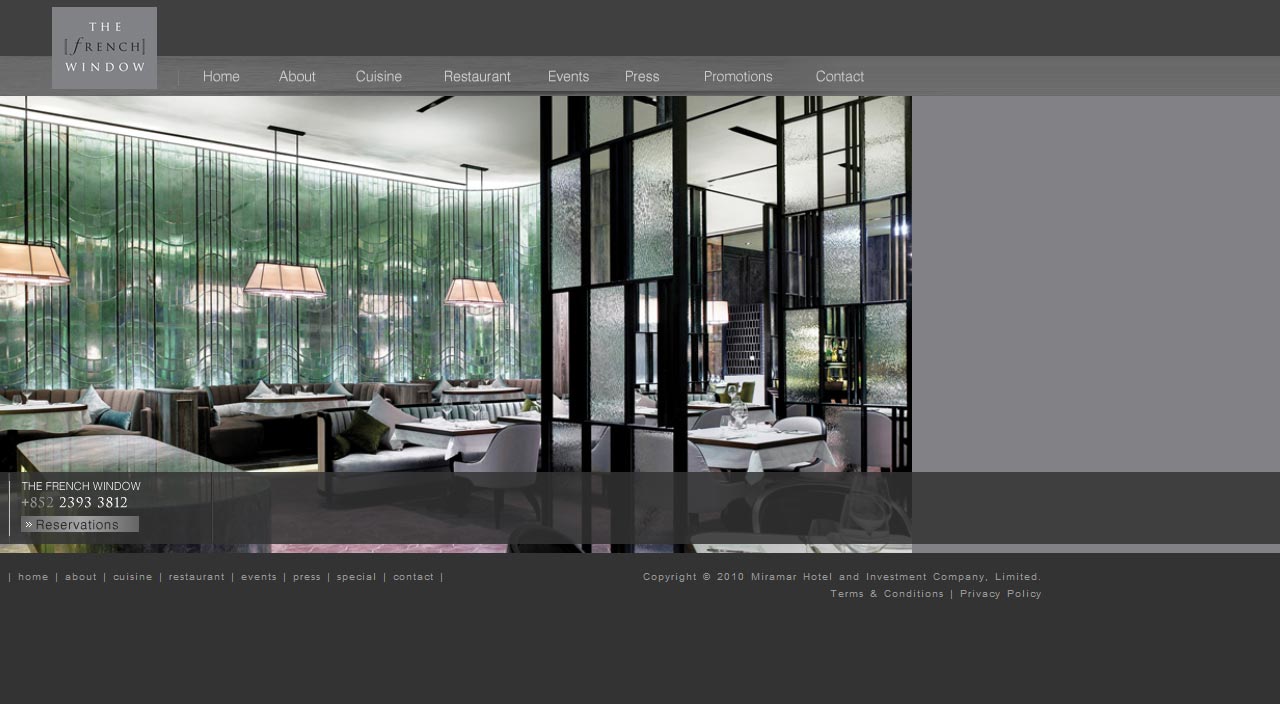
The French Window Restaurant
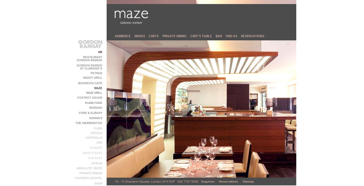
Gordin Ramsay Maze
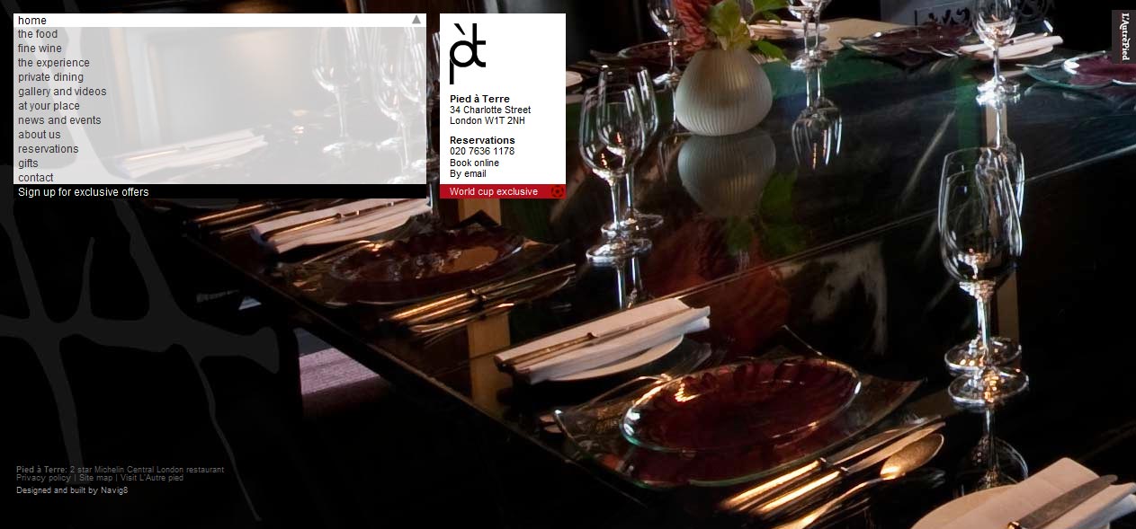
Pied à Terre Restaurant
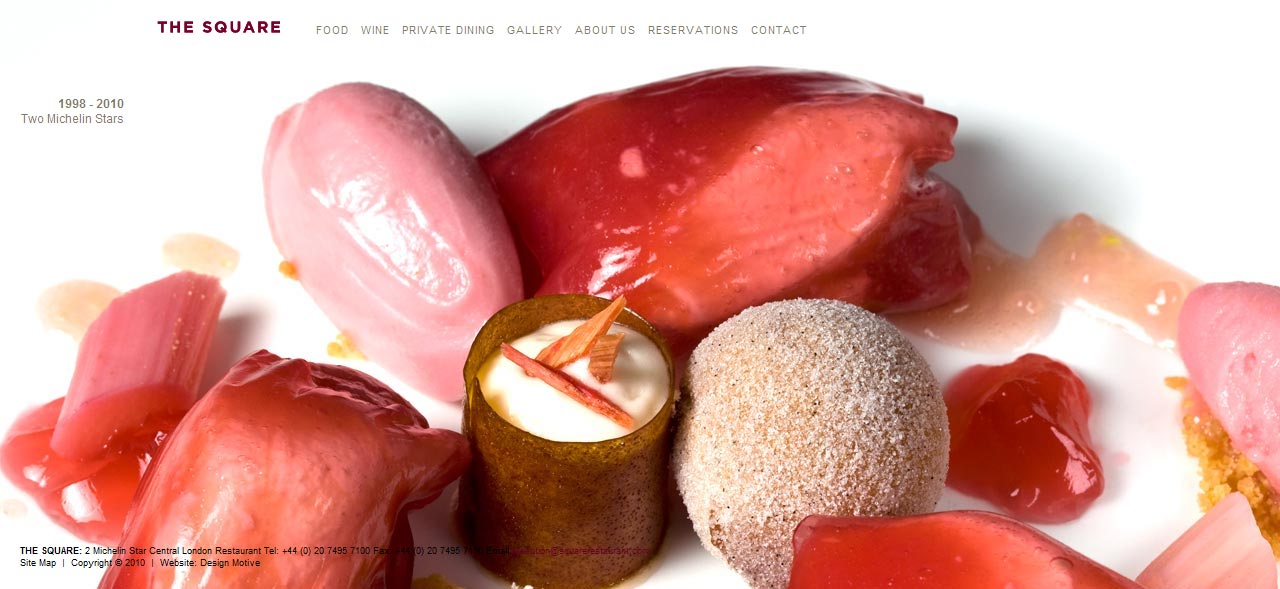
The Square Restaurant
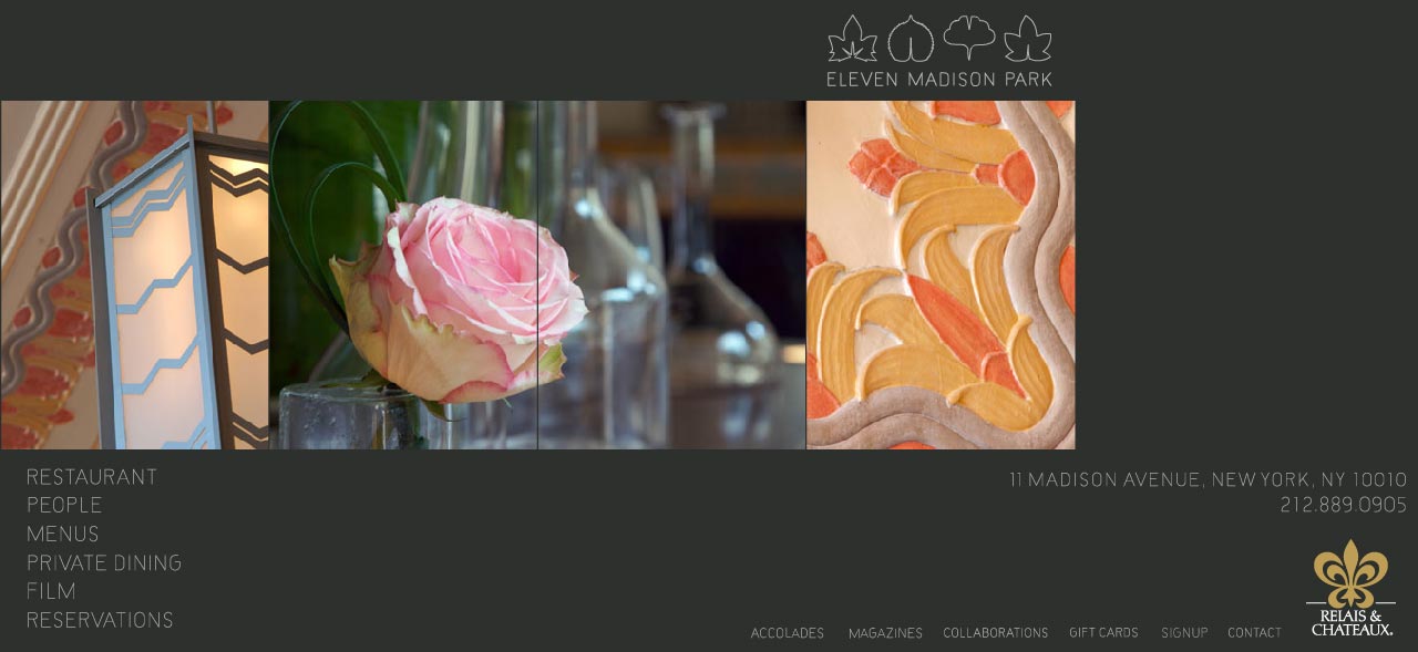
Eleven Madison Park Restaurant
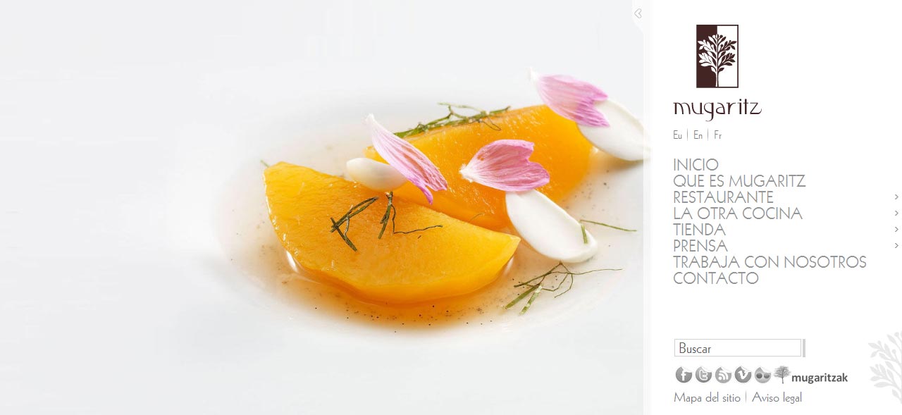
Mugaritz
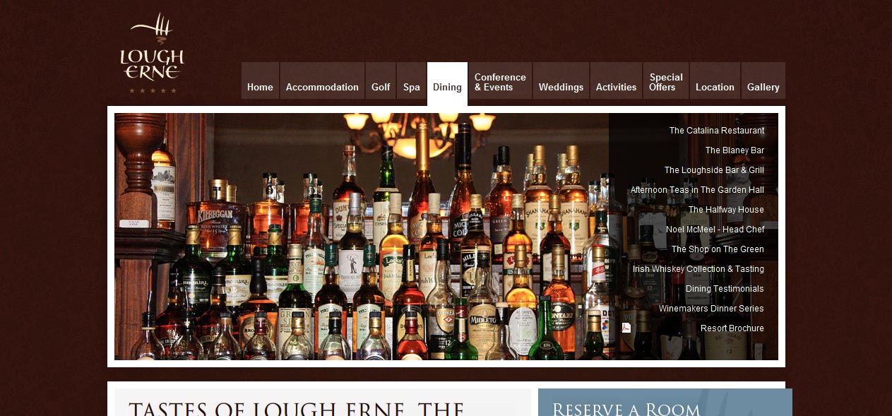
Lougherne Restaurant
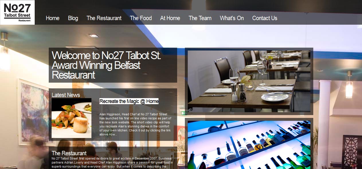
No 27 Talbot Street Restaurant
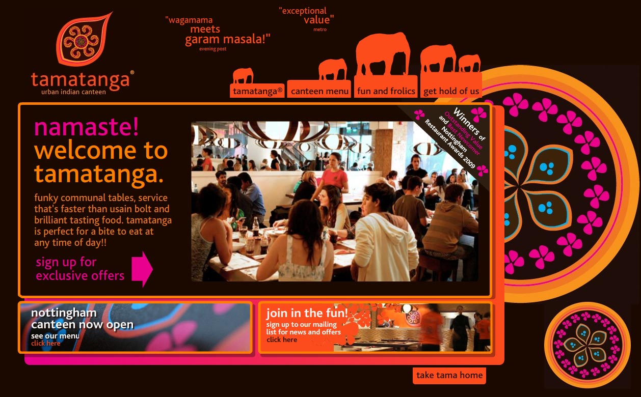
Tamatanga Urban Indian Canteen
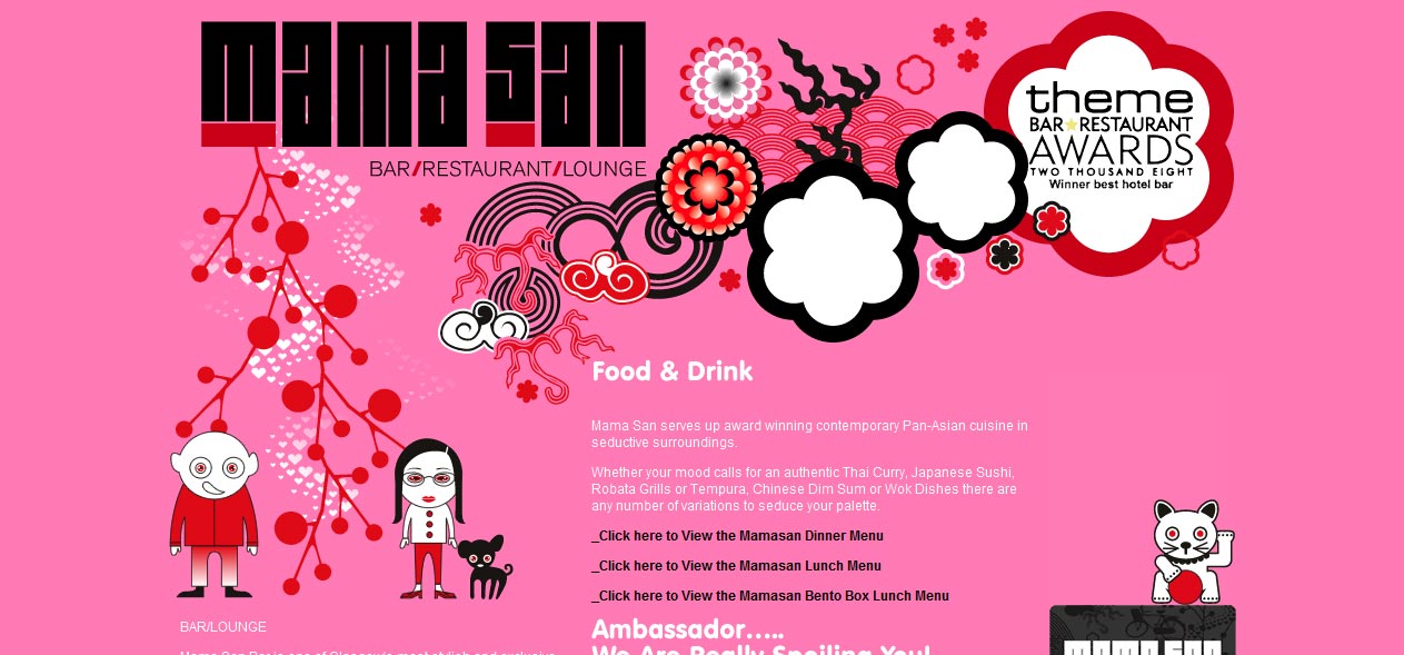
Mama San. Bar Restaurant Lounge
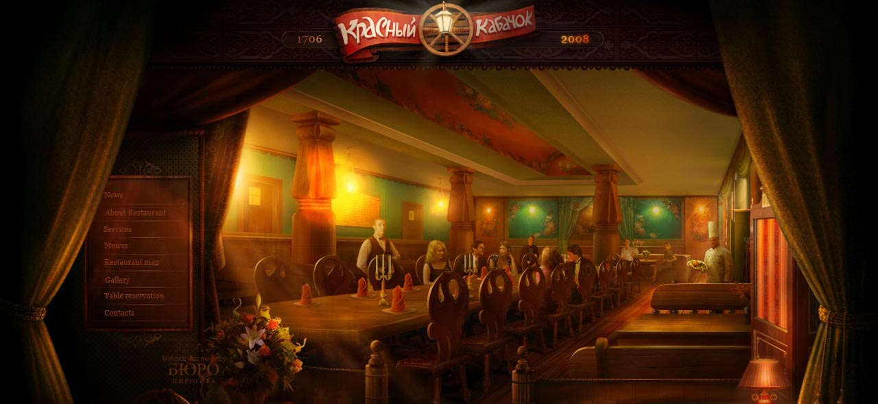
Redkabak Restaurant
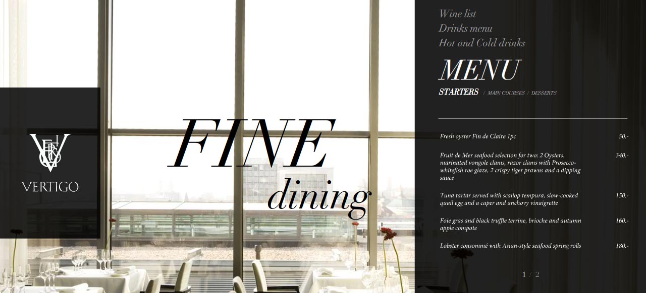
Vertigo restaurant
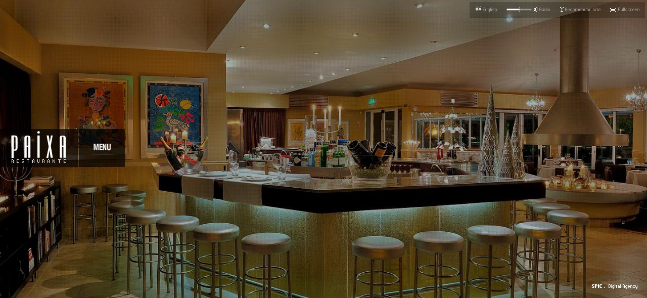
Paixa Restaurant
Conclusion
From this little showcase we can see that the beauty from our plates, showned to us by restaurants, is not limited to the offline environment. But, the sad part is that online, we can only watch and admire, when offline we can enjoy the actuale food. What do you think?
This entry was posted on Monday, July 12th, 2010 at 21:56 and is filed under Inspiration. You can follow any responses to this entry through the RSS 2.0 feed. You can leave a response, or trackback from your own site.


Thanks “Jack” for this delightful showcase :-). Can’t wait to explore each and every website on here!
Wow! beautiful collection! Some amazing work here. BTW, McDonald’s: don’t like their stuff, don’t like their website either.
Thanks for sharing
Love the Mellow Mushroom Restaurant and Giraffe web designs. Great list!
I tried to make a different showcase, with more diversity, and not from a programing perspective (xhtml/css/flash), more from a cultural perspective. This way you can see different approaches , even if trends do keep to pop out.
@sneah you are very welcome! had a blast searching for them
@bebopdesigner I’m glad you enjoyed it, except the Macdonald’s website 🙂
@callum I’m glad you have enjoyed it:)
Wow! Great list. I especially like the Noodle Box because they are the perfect food for a hungry designer on the run!
Thanks for that amazing collection, some of them are really nice !!
Nice collection, here’s another cool restaurant website:
http://soprano.lublin.pl (Pizzeria Soprano) from my neighborhood.
I was doing a website for a restaurant recently and was looking for a showcase just like this one, and couldn’t find it!! Thanks for the inspiration!
I’m glad I could help:)
Great collection but…
Really not one to criticise other’s work (as people have done that enough to us) but really can’t see why Cafe Rouge made the list?
Doesn’t inspire really, their map is all screwed up (with Milton Keynes in the middle of the sea), slow-to-load Flash used at the top to no real benefit etc etc.
Maybe I missed the point here, but there are so many inspirational sites that it seems a shame to put this one on the list.
Critique is a bad word, lets say it’s a little feedback. The purpose of this showcase is to show how restaurants, by there design, impact there audience. And I tried to find websites from every region of the world that have “something to say”. Even if, compared with the other websites, cafe rouge hasn’t got that charisma, it is a restaurant that has something to say.
ps: searching for the 50 best restaurants of the world, you will see that only 5 or maybe 8, at list, have a decent website design.
Great showcase here, thanks for sharing.
Moona.jp: Flash-based websites are DEATH for restaurants. When do people want to find a restaurant? When they’re on the road. Walking about town. When they’re using their smartphones, half of which don’t support flash. The same is true of La Maison Bisson
The Giraffe: Hover is another weakspot for restaurants that want impulse visitors, again because it’s not supported in smartphones.
Otherwise a pretty collection. And nobody would care if McDonald’s was anything but garish, because McDonald’s isn’t food, it’s barely human fuel.
it’s true, flash not being able to be found/crawled by search engines is a downer, but still, this is a showcase about the design.I was interested in there visual approach and impact .but if you take a look at it design and impact, imagine what a good marketing plan could do with this little baby. when your target market is regional or national, it doesn’t really matter if people can;t find you online, especially when a viral champagne can do the job for you. people forget that websites are touchpoints, and not every time you get from one point to another thrum a straight line.
Great list. There are some very nice designs.
yummy collection 🙂
merci