Showcase of 60 Brilliant Call to Action Usage
In this new web 2.0, it has become essential for website to implement certain tactics that makes the user to click their designated spot. One of the newest trend of web design is call to action. Call to action is where the user is attracted to a certain part of the page or a button and makes them want to do something.
You can see that call to action makes a lot of difference in the user’s decision.

If you want to use some of the best CSS3 call to action buttons, my favorite one is BonBon buttons. They are probably the best buttons I have seen. It is free to use them on your site. So, if you are interested, check them out. The preview of some of the possibilities with the BonBon buttons are shown below.

Call to action can be achieved by different methods such as bigger size, contrast, color, shape etc. The main goal of the designer is to grab the attention of the user. They are very important in making sure that the user knows their button or section and impresses the audience to click. Here, I have collected websites with some of the best usage of call to action.
TheCommentor
Clover
QuoteRobot
WPCoder
PSD2HTML
EmailCraft
PixelCrayons
Elegant Themes
WooThemes
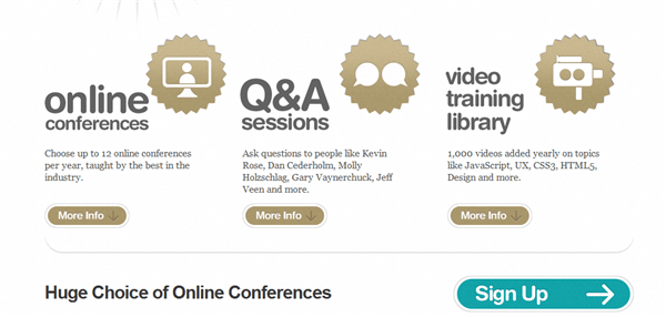
Think Vitamin Membership
Honey Grove Design
John Shammas
Go Freelance Jobs
FluentBox
fatih tanrverdi
Who is Leon
Grzegorz Kozak
Curio Productions
Maksimer din konverteringsrate
VPS
charity: water
Sensational Jobs
Boxed Art
xhtmlCafe
RIPIE6
Miro
HappyTapper
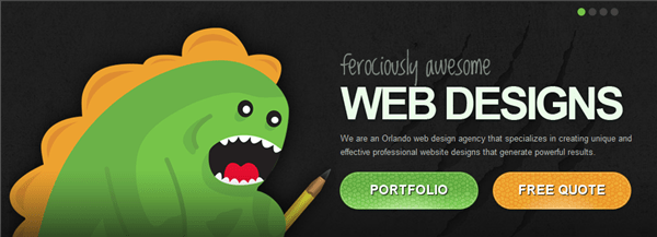
Orlando Web Design
Quodis
Carbonmade
Tucson Web Design
FINCH
Alexarts
Flavors.me
IconEden
Wistia
Ruler
Ashraf Khattab
m3mi
10 Buck Tuesday
iBrainstorm
Weather Maps
Sonny T.
SmartCube
Aviary
DIYthemes
Basecamp
Tender Support
Appcelerator
Pictage
Get Satisfaction
SpiderOak
Hoptoad
Page.ly
Tweetment
Realmac Software
Zendesk
Denote App
Notebox
CloudFlare
Conclusion
As you can see, the buttons and sections are very enchanting and pressures you to click. Some of the website have added extra elements to make it even more tempting. The call to action is very clear and I hope this has motivated you to create your own call to action buttons or sections.
This entry was posted on Thursday, October 21st, 2010 at 07:27 and is filed under Inspiration. You can follow any responses to this entry through the RSS 2.0 feed. You can leave a response, or trackback from your own site.


Excellent post, very creative examples.
I am speechless about this list. what a wonderful share. Thanks a lot.
Glad you liked it