Creating a Text Drop Shadow without using CSS3
Even though many people are seeing users upgrade their browsers to newer ones from IE6, it is still useful to know how to use drop shadow without using CSS3.
The method means it will not rely on images, so there will be less data needed to be downloaded to the client’s browser and less time needed for you to create them using a software package such as Adobe Photoshop.
I personally have not seen it used widely and is surprising as it is actually an easy method.
1) Create the text you want
Simply create an element, I’m going to use a div, and put in the text you want shadowing.
Put an element around this, we will need this for the shadow.

2) Create shadow text
Create a copy of the element. You will have two copies of the text now.
But how does this create the shadow? We now add some CSS to get what we want.
Using
<div class="text_container">
    <div class="text">
      Lorem ipsum dolor sit amet, consectetur adipiscing elit. Cras orci orci, lobortis sed feugiat eu, convallis non sapien. Donec eget porttitor ligula.
    </div>
    <div class="shadow">
      Lorem ipsum dolor sit amet, consectetur adipiscing elit. Cras orci orci, lobortis sed feugiat eu, convallis non sapien. Donec eget porttitor ligula.
    </div>
  </div>
add the following CSS
 .text_container {
  position: relative;
 }
 .text_container .text {
  color: #333;
  position: absolute;
  top: 0;
  left: 0;
  z-index: 2;
 }
 .text_container .shadow {
  color: #bababa;
  position: absolute;
  top: 1px;
  left: 1px;
  z-index: 1;
 }
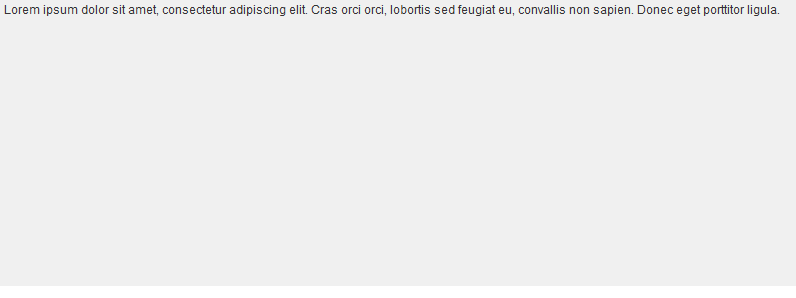
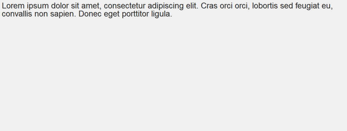
This should give you the following outcome:

Conclusion
You may realize that when users copy and paste the text, they will get two copies of the text. For this reason it is not ideal to use this for large amounts of text which users may want to copy; this is not usually the case anyway. In addition it is effective to use this for headers and titles, it will maintain the same look across browsers and will not need the use of CSS3 or graphic software editing.
One other issue is that when using CSS3 or graphic software tools you can get a blur effect to the shadow. This way cannot achieve this but you get a good effect without the blur.
Thanks for reading.
Learn how to create attractive web pages with testking JN0-141 web designing course. Download testking JN0-342 videos and testking 000-833 tutorials for step-by-step learning.
This entry was posted on Wednesday, June 9th, 2010 at 09:23 and is filed under Tutorials. You can follow any responses to this entry through the RSS 2.0 feed. You can leave a response, or trackback from your own site.


A nice idea but we should be encouraging people to use CSS3 not add more markup to their HTML causing further load times. Besides, if a browser doesn’t support the text-shadow property, it degrades just fine (unless the drop shadow is crucial to the design of course).
Yes, I agree that people should upgrade their browsers! But if you look at these browser stats then you can see a lot of people still use browsers without CSS3 🙁
Well for May 2010 32.2% (IE6 + IE7 + IE8) of people used a browser that doesn’t support text-shadow (text-shadow support: http://www.quirksmode.org/css/contents.html#t47), where as 67.1% (Firefox + Chrome + Safari + Opera) supported text-shadow. So the majority actually support it.
The point I was trying to get across was that text degrades just fine if text-shadow isn’t supported – unless it’s part of layout and causes display issues.
be caution, maybe your website be banned of duplicated content while using this technique 🙁
This can be simplified :
Your textYour text>
And CSS :
.text_container{

position: relative;

color: #333;

}

.text_container span{

color: #bababa;

position: absolute;

display: block;

top: -1px;

left: -1px;

}
nice technique though it is better to use CSS3 for such support and you can achieve text shadow in IE using filters. This technique is impractical for real world situations, anyways good try
@Abhin
This is indeed true but we have to stay open for other ways, so in my opinion it’s helpful for beginners who don’t know how to use those IE filters to create these effects.
i’m with Ben on this one. We should be encouraging developers to be using CSS3, not adding more ‘unnecessary’ markup than is needed to stylesheets.
I suppose it’s a good technique to use in IE-only stylesheets. But then again, if the developer is using browser-specific stylesheets then he/she will probably know how to achieve the text-shadow in iE using filters. Or if not, they will *probably* have the sense to a little bit of Googling. meh. 🙁
That said though, it’s a pretty good technique Elliot.
Yeh, there are loads of pros and cons to using this. Like Jennifer R said, duplicates could be removed and yes I agree, we should use CSS3 more but the rate of new browsers being released is increasing and for some people their default browser of IE on their Windows copy is enough for them. It depends on the site we’re creating for, if its for a market for people who want to learn how to use a computer(!) then the chances of them using a different browser to their default is small. There is definitely an increase in people being able to use computers and years to come this will probably be an easy task for anyone.
If you want to validate to your style-sheets though then filters will pop up errors.
At the end of the day its what method works best for the situation!
For those posting stats, those numbers change depending on the site. A client of mine has 60% using IE. Yet for mine 57% are using FF, so you can’t go by numbers based on any one site. It has to be taken into context.
That said, while this is an ok idea, I’m with everyone else. Use CSS3, and let the rest degrade gracefully. I’m not about to add extra divs to get a simple effect most users are not going to notice, and ones in IE won’t know it’s missing.