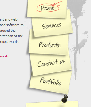
97 Beautiful Navigation’s for your Inspiration
Navigation is one of the key elements of designing a website. It is very important to have a very clean, informative and easy to follow navigation. Navigation is what keeps the user from going insane and helps them navigate around the site.
It is necessary as users are engaging in the site and navigation provides their destination. If they need to go to the home page, contact form or information about the website, it is almost next to impossible for them the find it easily without a navigation menu. As more users are visiting new websites, it has become even more essential have a clean, elegant and brief navigation.
Now, we also have entered the new era of web 2.0, so the navigation needs to enhanced in some way and made unique. So, here are some of the best navigation menus that follow these principles.
Alexarts
Candybar
Club Sites
Tutorial9
Attack of the Web
Sushi & Robots
Delibar
Gap Medics
Thibaud
Getraenke-Krukal
Mission Bicycle Company
Oink!
Clearleft
GETINVISION
Southern Media
Curious Generation Group
Utahtravel
f claire baxter
Gpacheco
Narwhal. Co
Jason Dorn
Delete
Jeffrey Sarmiento
Small Stone Recordings
Cassys Design
HANDCRAFTED CSS
Christmas Tweets
Ballpark
Custom Tshirts UK
XIXI NO BANHO
Microsoft
Carsonified
AdaptD
Sky Larkin
Ctrln
Lucia Soto
Dreamling
Neotelos
Gisele Jaquenod
Artcore-Illustrations
Mystery Tin
Netwise
Loodo
Tapbots
Checkout
Somos la pera limonera
marcusK
Joe Nyaggah
DFW Usability Professionals’ Association
Mailchimp
Web Design NJ
JP3 DESIGN
LemonStand
MetaLab
MacRabbit
Yorkdale
Jiri Tvrdek
Flicka
Graphik
Dreamer Lines
PixelResort
N.Design Studio
Media Temple
Kulturbanause
Diego Latorre
Fluxiom
Apple
Culinaryculture
Yodaa
Mimeo
Dpivision
Adidas
tap tap tap
Serigraphics
Mint
Inspire Image Design Labs
Lomotek Polymers
Jarnheimer Productions
Bert Timmermans
Kevadamson
Redvelvetart
Pampaneo
Taufiq Ridha
The Invoice Machine
The Great Bearded Reef
Ashes & Milk
Boloco
Freckle
Gugafit
BambooBali Arquitetura em Bambu
Indofolio
Elitewebmaster
ARIN s. r. o.
Stone Skipper
Global Creative Designs
David Hellmann
Dragon Interactive
Conclusion
As you can see, the examples were excellent and each was outstanding because it was unique. They look and follow the new trends of web 2.0. Many designers showed their creative side and displayed show magnificent navigation menus. Designers made it visually attractive so users are instantly drawn towards it.
The navigation menus are not cluttered and some navigation menus go in more detail by providing more sub-categories. I hope you got inspiration on navigation menus from this post and will apply these principles to make your website look better. This post is proudly sponsored by Sponsor: Windows 8 Themes. Please feel free to share your favorite ones in the comments below.
Download the latest Testking 646-671 design tutorials and Testking 70-643 videos by experts to get up to date information on web designing/development. Become expert with Testking 642-504 course.
This entry was posted on Sunday, April 25th, 2010 at 08:43 and is filed under Inspiration. You can follow any responses to this entry through the RSS 2.0 feed. You can leave a response, or trackback from your own site.


amazing inspiration list. thanks author
Great list. Thanks for sharing.
Wow, they are great. Like skyje said, amazing inspiration.
thanks, Kai
Wow… looking good.
Tesekk�rler �ok g�zel navigasyon �rnekleri var ben simdiden on tanesini ilham kaynagi arsivime ekledim.
thanks for this great posts!!
Fantastic nav work! Bookmarking this 😀