50 Amazing and Gorgeous Apple Related Websites
With the hype of the ipad taking over the news I thought it would be appropriate to showcase a number of websites that have been inspired or designed for an apple related product. The collection is outstanding. The attention to detail in each website seems to orginate from the amazing design of OSX. This maybe why there seems to be very few badly designed mac application websites.
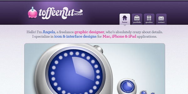
1. Toffee Nut Design
2. Jilion
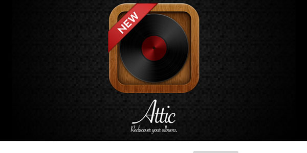
3. Attic
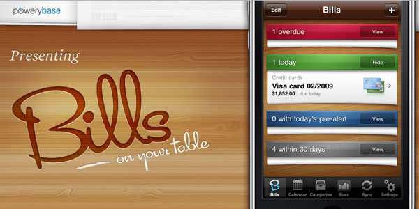
4. Bills
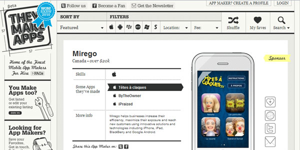
5. They make apps
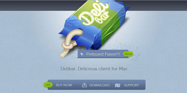
6. Deli bar
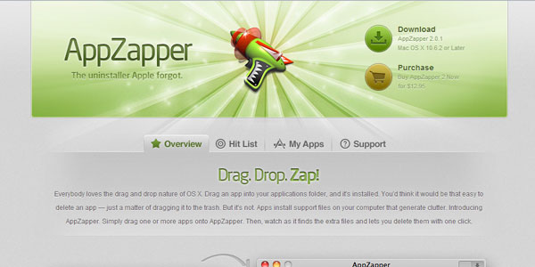
7. Appzapper
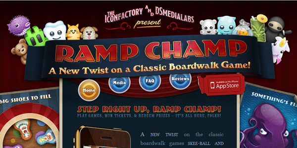
8. Ramp champ
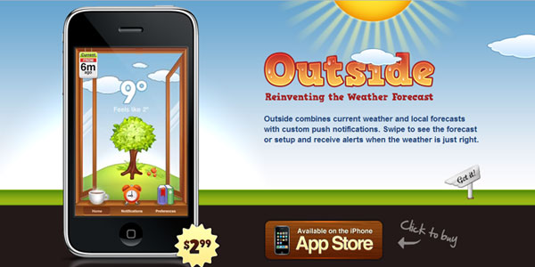
9. Outside
10. Transmissions
11. Finger
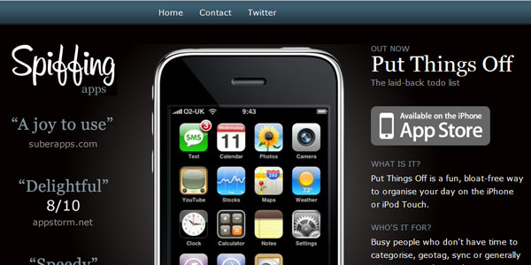
12. Spiffing Apps
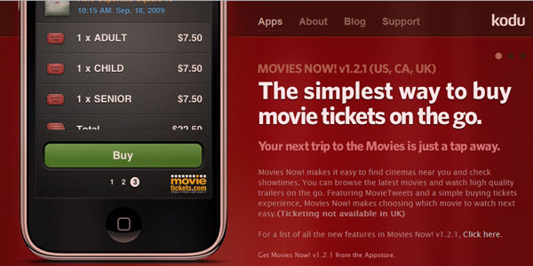
13. Kodu
13. Buzapp
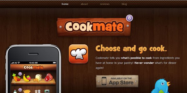
14. Cookmate
15. Tea Round
16. Broader Sheet
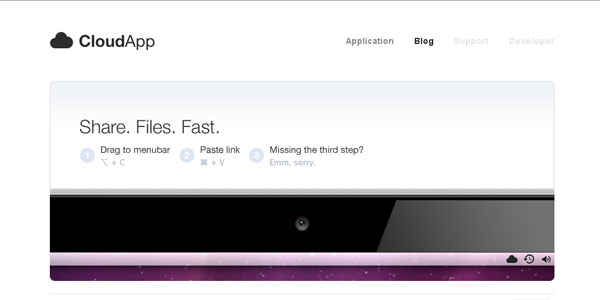
17. Cloud App
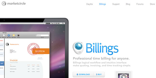
18. Billlings
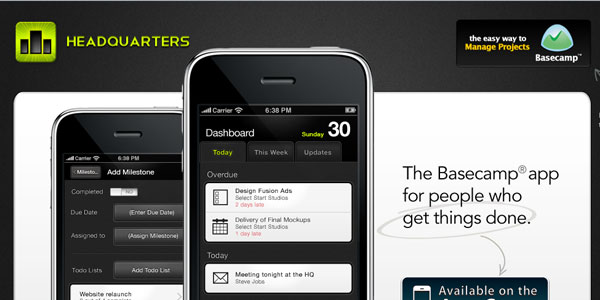
19. Headquarters
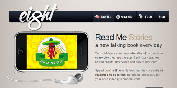
20. 8interactive
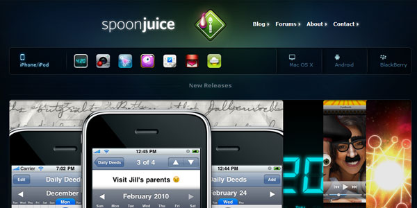
21. Spoonjuice
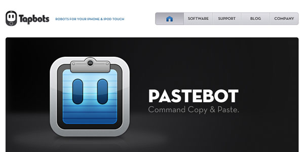
22. Tapbots
23. Panelfly
24. Firetask
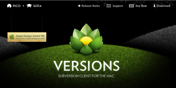
25. Versions
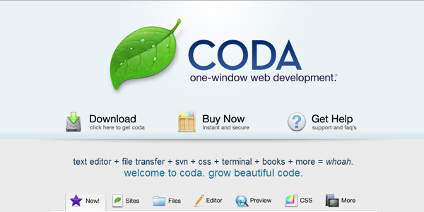
26. Coda
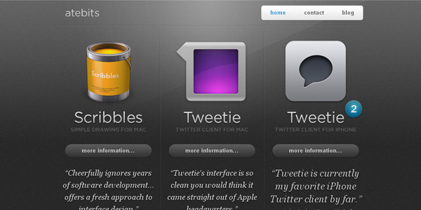
27. Atebits
28. Cultured Code
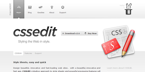
29. CSSedit
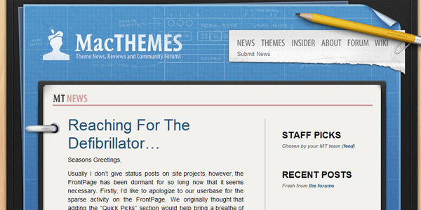
30. Macthemes
31. Real mac software
32. Espionage
33. Task mate
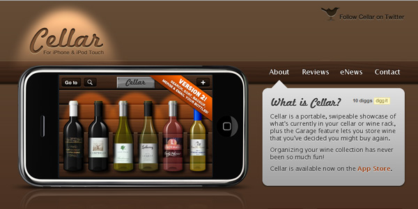
34. Cellar
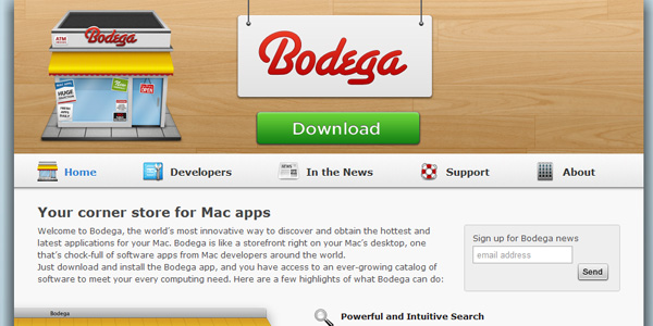
35. Bodega
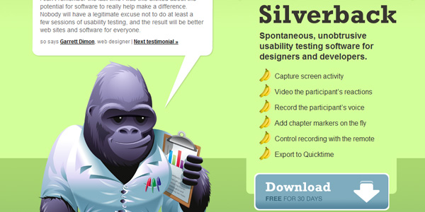
36. Silverback
37. Check out
38. Ecoki
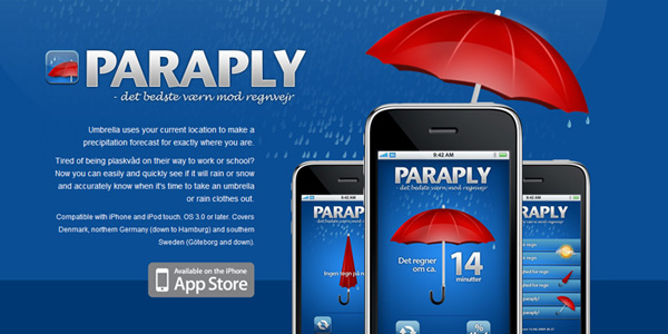
39. Paraply
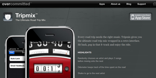
40. Tripmix
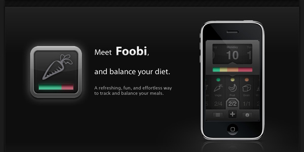
41. Foobi
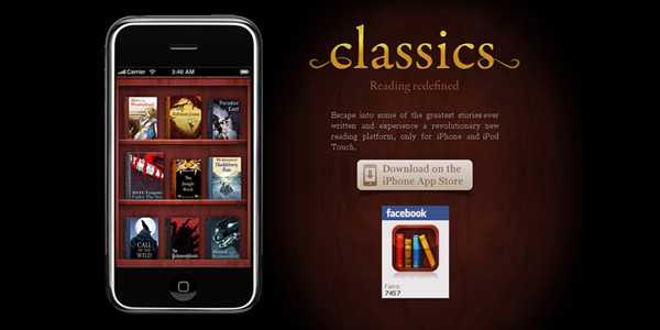
42. Classics
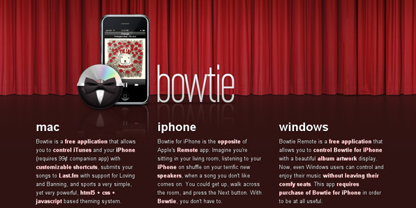
43. Bowtie
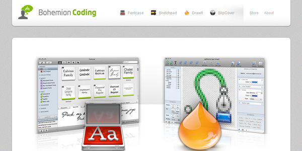
44. Bohemian Coding
45. Acrylic
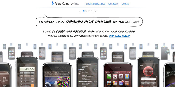
46. Alex Komarov
47. Dropbox
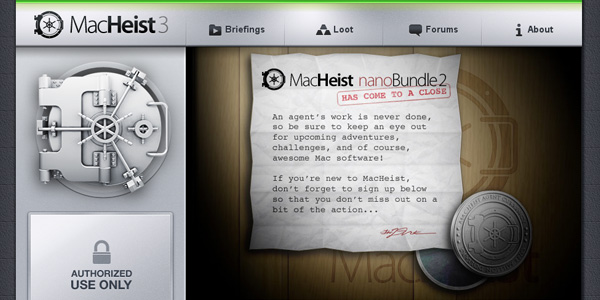
48. Macheist
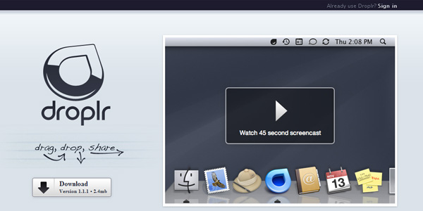
49. Droplr
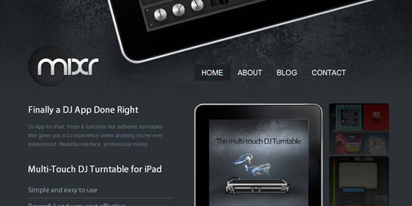
50. Mixr
Conclusion
So what can you learn from these websites? Well, if you like this type of design and wish to replicate it then I suggest paying close attention to every element in your design. Make sure colour and size contrast demonstrates a good visual hierarchy, this will most likely lead to a good user experience.
A final point to make would be subtlety. When applying gradients, don’t make the color range too great, when adding a border make sure it is bright or dark enough to be noticed, but not so much that it distracts the user. I hope these websites and the couple of points I have just made help you with your next web design.
For beginner as well as expert web designers, testking EC0-350 design tutorials really help to understand the fundamentals of web design. Download the testking E20-501 guide and testking EX0-105 tutorials to become expert.
This entry was posted on Friday, April 9th, 2010 at 08:44 and is filed under Inspiration. You can follow any responses to this entry through the RSS 2.0 feed. You can leave a response, or trackback from your own site.










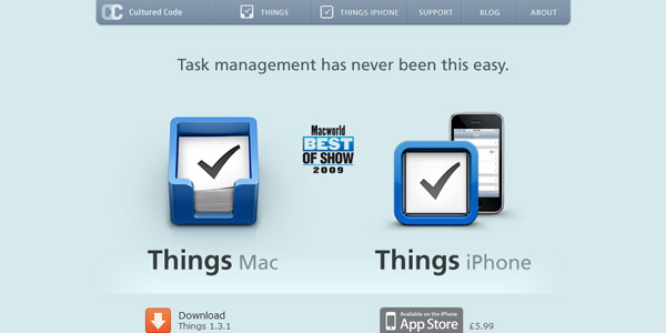






Great for inspiration! Thanks. The Cultured Coded Things website is still one of my all time favourites by the way
Great list!!
What about http://www.tapmates.com guys 🙂
No list like this is complete without http://www.dunnitapp.com
Try checking our Giro AppSolutions’ website, too. Pretty simple, but very sleek.
Giro AppSolutions, Inc.
Wow! Looks like the creatives behind these sites all just copied each other. Maybe it’s time for a new trend?
yeah very nice thanks 🙂